Long, short.
Short, Long
Long short long short, short long…
There’s a lot of back and forth and “what-to-dos” about landing page length.
The good news — there really isn’t a whole lot of decision-making to it.
Your landing page length isn’t going to be a choice that you make.
It’s going to be a natural reflection of your landing page offer.
Generally speaking...
If your offer is a low-risk, easy-breezy, pocket-cash decision, your words might be few and your landing page short.
If your offer is a high-risk, complicated, money-spending decision, you might have a few more words to say to convince and convert.
Of course, there are always a few rebellious exceptions — and that’s why we A/B test — but, for the majority of the batch, these generalities hold true, each with the power to convince and convert.
So, what do you do?
Instead of focusing on the long and the short, focus on what you’re offering and what you’re asking, identifying and countering any relevant objections.
From there, your landing page length will become a no-brainer, naturally falling into place, being no longer and no shorter than what it’s meant to be.
Here’s how to get started…
Get brand new landing page strategies straight to your inbox every week. 23,739 people already are!
What Am I Offering and What Am I Asking?
This is your stop, and standstill, point-of-reflection moment.
Take your time and ask yourself, what is it that I’m offering and what exactly am I asking?
Is it something that’s easy to understand?
Is it fairly straightforward?
Is it common knowledge? Self-explanatory? Low-risk?
Easy to trust?
Or…
Is it something that’s hard to understand?
Is it an investment?
Does it come with layers of learning?
Is it high-risk? complex?
Hard to trust?
These questions are the kinds of questions that will begin to lay the foundation for the kind of landing page length that’s ahead.
If your offer reflects the second batch of questions, you’re probably going to have a lot more explaining to do in order for you visitor to feel comfortable enough to accept what you have to offer, and do what you’re asking them to do.
Think about it like you would a construction manual.
To build an airplane — a real, life-size, flying airplane — you can imagine the kind of construction manual that’ll need to come with it.
It’ll be long, really long.
Since an airplane is complex, expensive, and high-risk, there’s a lot about it that’ll need to be explained for you to feel comfortable enough to commit to it, and build it.
But, what if it comes with a three page manual?
Would you commit to it then? Do you think you could be convinced?
Would you trust it to get you from the parts, to a plane? From the ground, to the air?
Probably not. You would need to see more.
The plane (the offer) requires a longer manual (a longer landing page design) to explain what it is and how it’s going to work -- getting you to do what you came there to do (the ask).
That’s just the nature of the offer.
Your landing page length isn’t any different.
“The bigger the ask, the longer the page” says Neil Patel.
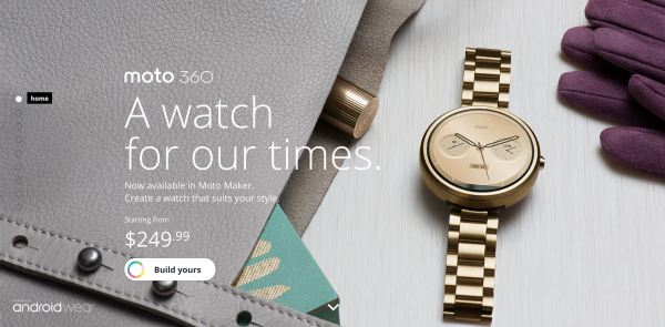
Moto 360, a wrist watch by Motorola, is a perfect example of a big ask, long page.
Take a look:
From the length of their landing page, they know what they’re offering and what they’re asking, taking the necessary steps to address any objections.
For a watch, 250 dollars is a fairly big ask.
Without a long landing page, there’d be little room to explain and even less room to convince.
And, at 250 a pop, no one would buy.
If your offer is complex, requires some trust, and has a couple layers to understand, you’re going to need a little more room to convince and convert — thus, a longer landing page is formed.
And, the opposite goes if you find yourself identifying with the first batch of questions.
With a much more easy-to-grasp, straightforward, and low-risk offer, you’ll have a lot less to explain, requiring a lot less room, resulting in a lot shorter of a landing page.
So, take some time and reflect on those questions.
Figure out what kind of offer you have, and what you’re asking, and start to meditate on what it will take to explain it — no more, and no less.
What Are My Objections?
Objections are those pesky concerns that come up and can keep your visitor from accepting your offer and making a decision.
In one of my most recent posts about landing page friction, I call these objections “Ms. Negative Nancy” -- a mindset that takes over when we experience confusion and uncertainty.
Anything about your offer that can trigger this mindset, and cause a hesitation, is going to be considered an objection.
With that said, there’s no doubt that having a complex, high-risk, and in-depth offer will raise more objections.
And, the more objections you have, the more you’ll have to counter, and the longer your landing page will be.
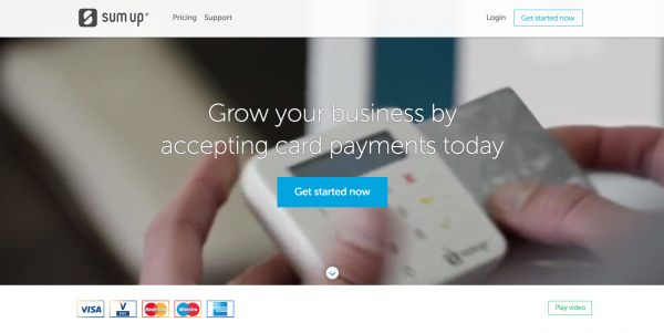
As an example, let’s take a look at Sum Up, a product that helps businesses accept credit card payments.
Since their offer revolves around money and credit, it’s likely that there’ll be a few things to object.
Will it work?
Can I trust it?
Is it secure?
Is it a hassle?
Will it stop working abroad?
Because of these objections, it’ll take a bit more convincing to help carry out the ask of their offer -- hence, their longer landing page length.
On the other hand, if you have an offer that’s very straightforward, and is a decision-made-easy, you won’t have many objections that can’t be overcome by the simple and clear presentation of your offer, itself.
So, for all those low-risk, easy-to-get, no-cash offers -- you could be nearing the end of your landing page length.
Like NewsGIF, for example. An app that brings news in the form of a GIF.
As you can see, their landing page is short. Extremely short.
That’s because their offer is small, and their ask is low-risk.
They clearly present exactly what they're offering, and with nothing to object, there’s really no need for any extra convincing.
If you’re confused about what, where, and how to recognize your offer’s objections, you can survey your visitors using these easy tools: Intercom, Qualaroo, and Survey Monkey.
All three of them allow you to connect, ask questions, and receive comments from your visitors about your offer -- providing you with first-hand, valuable feedback about their experiences and hesitations.
This is valuable in helping you to create a landing page length that will cater to their needs.
A/B Testing
By now you know that your landing page length is a direct reflection of your offer, your ask, and any countered objections.
but...
How do you know that the landing page length you’ve come up with is a direct reflection of your offer, your ask, and countered objections?
By making it live and putting it to the test.
Allow your visitors to see it, use it, and experience it.
In doing so, your conversion rate will start to reveal how well your landing page length matches with the true risk and challenge of your offer.
If you have a low conversion rate…
This means, what your visitors wanted to see doesn’t match up with what you thought they needed to see, in order to convince and convert.
This can be a result from two things: either you didn’t know enough about your audience, through visitor and customer feedback, to properly form your landing page length...
Or, you’re simply an example of the “big ask, long page” exception.
Either way, if your visitors aren’t turning into customers, you might be in line for a different kind of landing page length.
And, the only way to know, for sure, includes customer feedback and A/B testing.
Below is an example, an A/B case study, from Michael Aagaard.
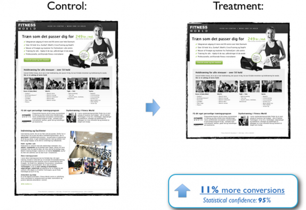
As you can see, this popular gym initially had a longer landing page (the control) and then decided to A/B test a shorter landing page (the treatment) to see if it would have an impact on their conversion rates.
It did.
The shorter landing page jumped conversions by 11%.
Why?
Michael Aagaard explains:
“The gym chain is well known, and the offer is simple and inexpensive.
So there’s a low level of commitment and perceived risk involved…”
The lower the risk, and the lower the commitment, the fewer the objections and the shorter the landing page.
From this A/B case study, the gym learned that, even though they might have properly identified their offer, ask, and objections, there was a better way of more clearly doing it than what they had initially assumed -- a shorter way.
Here’s another example by Michael Aagaard:
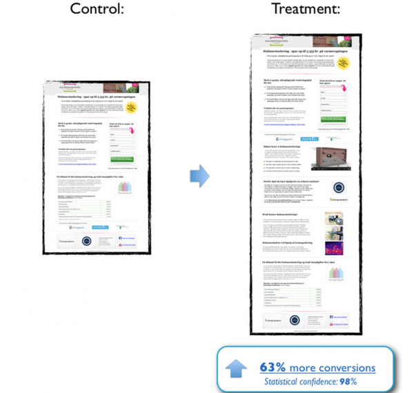
Here we have a shorter landing page (the control) being tested against a longer landing page (the treatment) for a home energy audit company.
As you can see, the longer landing page came back with a 63% increase in conversions -- outperforming the initial, shorter landing page.
Why?
As Michael explains:
“The company is not that known, and it’s a complex offer that could result in a large investment.
So there’s a high level of commitment and perceived risk involved…”
The higher the risk, and the higher the commitment, the more raised objections and the longer the landing page.
If you want more landing pages tips...
To Recap…
If you're stressed out about your landing page length, don’t be.
You don’t have to think about how you’re going choose between a long landing page and a short landing page -- the choice is made for you by the reflecting and answering of your offer and your ask, and the objections that come with it.
As a general rule of thumb, remember:
The bigger the offer, the longer the landing page. The smaller the offer, the shorter the landing page.
And, if you think that you might be the exception -- grab some visitor feedback and begin to A/B test.
P.S. If you took home something new, or just enjoyed the read, make sure to share! :)
