


Do you have to split test?
No, you don’t have to. Just like you don’t have to wear a bra or sports briefs when you jog—but you do, because it hurts if you don’t.
Letting poorly optimized forms and landing pages run during a marketing campaign is bad (because it wastes money).
And not knowing if those forms and landing pages are poorly optimized is even worse (because it means you’re flying blind) 👀
👆 You don’t even know you’re wasting money 😭
Knowledge is power and, in digital marketing, that power turns into positive ROAS (return on ad spend) and ROI (return on investment).
By the end of this post, you’ll know all about testing single and multiple variables on ads and landing pages.
You’ll also know
- what the very best things are to test
- where those things go, and
- how you test them
Mmhmm.
👇 Get started.
Get brand new conversion strategies straight to your inbox every week. 23,739 people already are!
Split testing is about optimization
Consider your sales funnel when split testing (step 1):
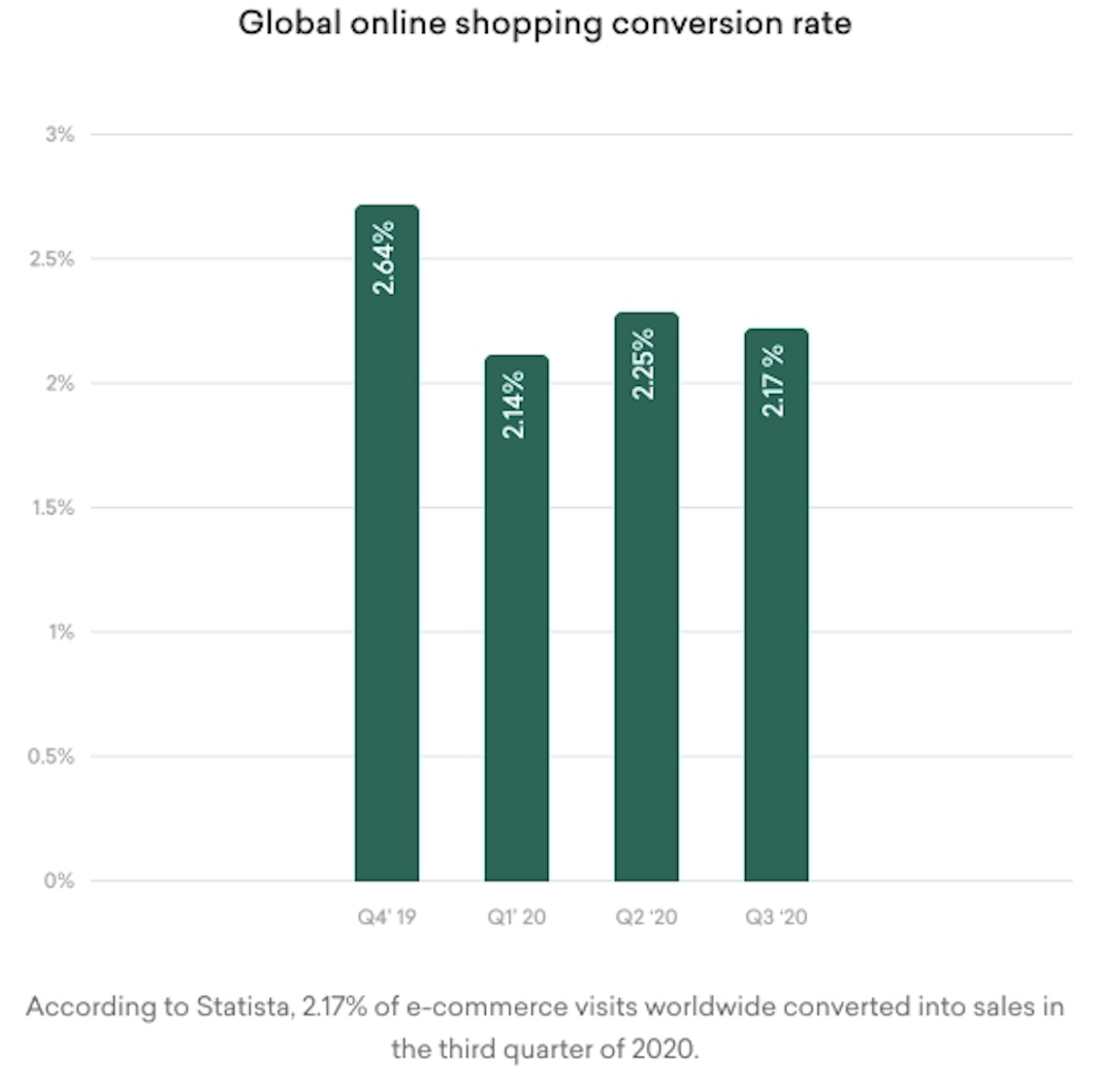
Your PPC and SEO efforts attract website visitors to the top of the funnel. You assume that more visitors to your website means more customers, but here’s the problem: only 2 out of every 100 people (globally) make a purchase.
That’s 98% of wasted spend.
Thankfully, there’s a way to broaden the funnel (step 2), so that more of your visitors convert into customers: it’s called conversion rate optimization.
Optimization is something you do to make the best use of a resource.
When you design a new website or landing page, you’re not sure what’s going to work 🤔. That’s why you create different versions of a web page (step 3) to see which one outperforms the other (gets the most conversions).
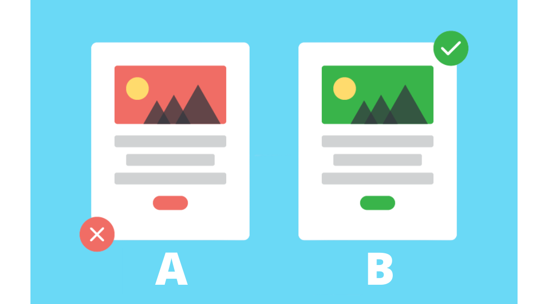
What is split testing?
Split testing (aka A/B testing or multivariate testing) makes controlled changes to content (like ads, landing pages, and forms) to compare which version (A or B) improved a metric (like click-through rate, form completions, or purchases).
There are two types of tests you can run. Decide which works best for you (step 4):
A/B testing tests one variable at a time (button color, for example) to see which version wins.
Multivariate testing, on the other hand, tests multiple variables (the button color and the button copy, and maybe the form headline too) to see what combo of changes convert best.
Both are forms of split testing because different versions are tested against each other.
When running a test, website traffic to the page is split among the different versions, and performance is tracked. Whatever version converts the most at the end of the test ✨ wins ✨
Split-testing ads
Split testing divides your audience into random, non-overlapping groups who are shown ad sets with identical creative.
Randomization ensures the test is conducted fairly because other factors won’t skew the test results of the group comparison. It also ensures each ad set is given an equal chance in the auction.
Each ad set has one distinct difference, called a variable. You'll determine the control and the variable (step 5).
Examples of variables:
- Audience types
- Placements
- Delivery optimizations
If you test two different audiences against each other, you can’t also test two delivery optimizations simultaneously, because you wouldn’t know for sure which change affected the performance.
Split testing is based on what people respond to—gathering results across multiple devices (step 6).
The performance of each ad set is measured according to your campaign objective and is then recorded and compared. The best performing ad set wins.
What should you test on ads?
Here are some initial variables to test (steps 7 to 15):
Target audience
Choose different audiences and test them against each other.
Delivery optimization
Run a split test with one optimized for conversions, and one set for clicks.
Placements
Select automatic or customized placements to define where you want your ads to appear. Your best bet is to test custom placements against automatic placements instead of custom versus custom.
Ad copy
Test size, color, shadowing, font, and the ad copy itself.
Border inclusion
Does your ad stand out better with a white background or will it draw more attention with a black vs. colored border?
Call-to-action (CTA)
Test action buttons vs. text-based links
Promotion
Compare free shipping offers and discount offers like “save 20%” vs. “save $20.”
Price points
$0.99 vs. $1 or “lowest price guarantee”
Headlines
Often the only thing read, this is the most vital part of your ad (and landing page). Consider stating a fact, asking a question, highlighting a feature, or addressing a pain point.
You can never be 100% sure what change is going to move the needle in the right direction, so it’s always good to have a list of future tests ready to go (step 16).
In some instances, changing the button color will lift your conversion rate. On other ads, button color doesn’t matter as much as a copy change.


Split testing landing pages
Ideally, we’d like to test a small page element variation on landing pages to hone in on what changed the conversion rate.
The problem with this ideal split test is that each small change requires hundreds or thousands of visitors to declare a winner.
That’s why we like to start our clients with two completely different designs (step 17), so we can get a bigger result much quicker.
Don’t focus on the button color conversion myth (step 18).
👉 There is no one magical color that guarantees conversions, the same way there isn’t an ideal number of fields to use on your form 👈
If someone preaches that, maybe it works for their business. But their business is not your business. And their audience might be after a different sort of user experience than your audience.
If you have a horrible conversion rate, changing the button color isn’t going to save that.
You may have to change your offer or the language surrounding your offer (step 19).
1. Start with a reason to test (step 20)
Are people not scrolling down the page? Does the page load slowly? Did you create a user poll and get data back on this? Find the problem first, so that you can find the correct solution.
2. Create a hypothesis (step 21) and test it (step 22)
Based on the answers you get, you’ll be able to determine (hopefully) what needs to change.
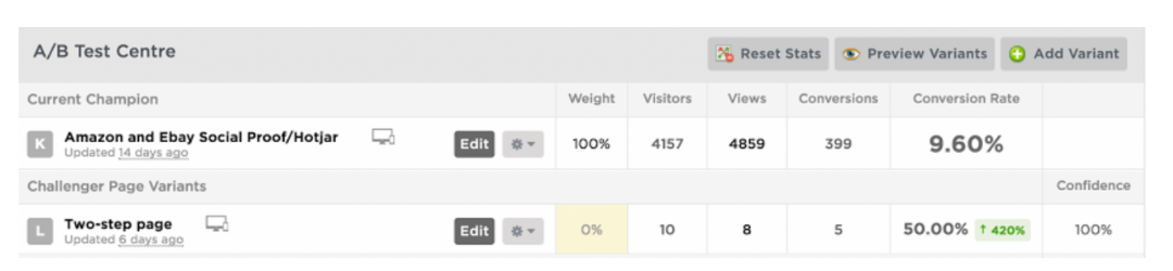
We had a client who was not converting well, so we put a Hotjar poll on the page asking what the stumbling block was. The biggest answer was “not trustworthy.”
🪄 Voila ✨
We added testimonials, logos of certifications and awards, and images of the factory to increase conversions by 30%.
In our next test, we created a two-step form asking qualifying questions on the first step and asking personal questions (name, phone number, and email) on the second step. This resulted in a 420% increase in conversions with 100% confidence.
3. Calculate your sample size (step 23)
There’s a way to calculate sample size manually, but it involves some serious math. Optimizely’s calculator is great for this.
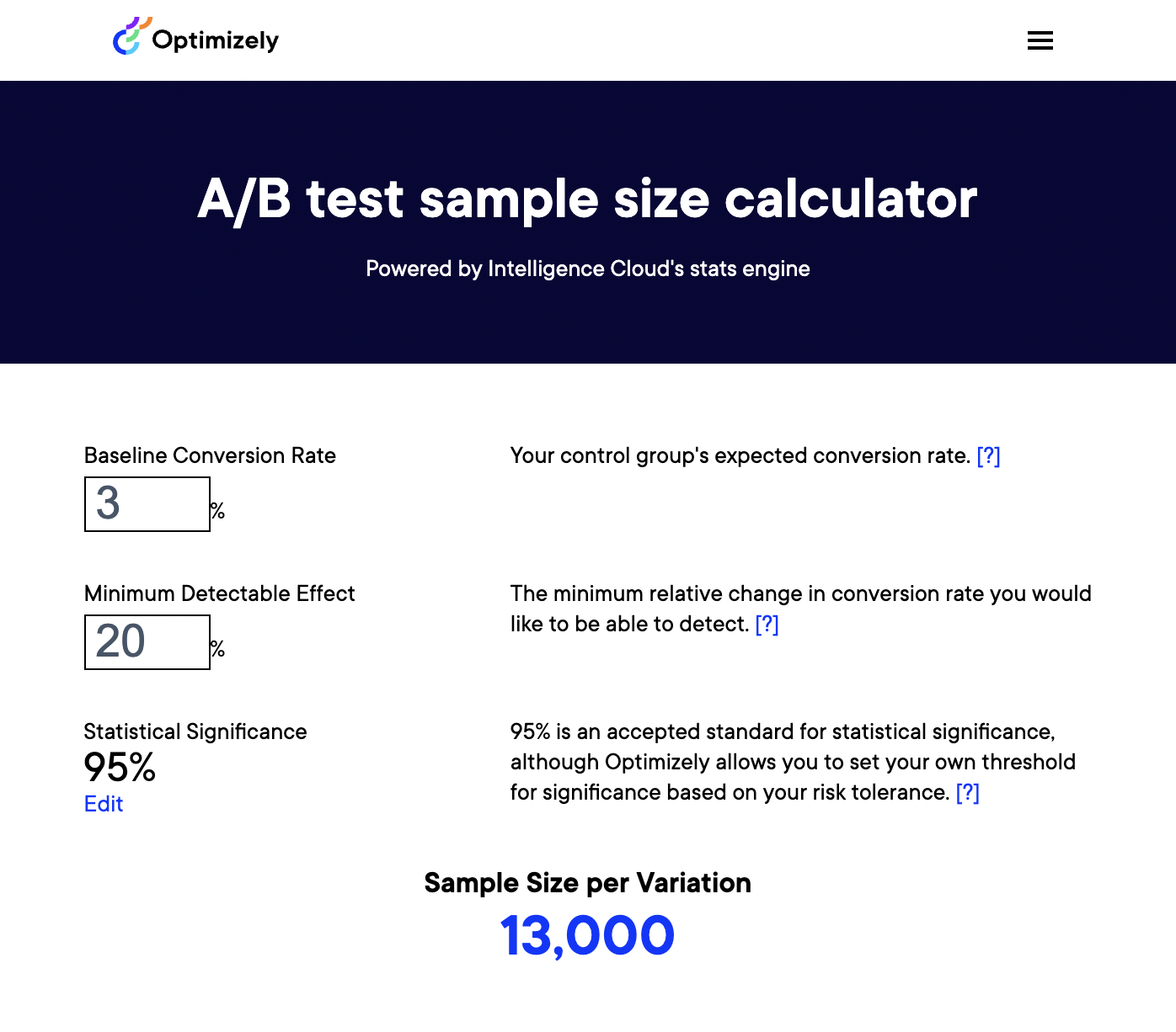
Here’s what you'll need to find out and input to calculate an accurate sample size (steps 24 to 26):
Baseline conversion rate:
What’s the conversion rate of your original page? The higher it is, the fewer visits you’ll need before you can declare a winner.
Minimum detectable effect:
The minimum relative change in conversion rate you want to be able to detect. A 20% minimum detectable effect means that, at the end of the test, you can only be confident that a lift or drop in conversion rate higher than 20% is a result of your adjustments. The lower your minimum detectable effect is, the more visits you’ll need before you can conclude your test.
Statistical significance
We know that we want to be at 90% confidence (at least) before we decide on a winner.
If you notice that a new variant is already losing, but there’s still low confidence, lower the weight of the variant until it runs its course—the weight being the percentage of people who will see this variant.
4. QC your testing (step 27)
Make sure that things like traffic sources and referring ads are the same for both pages and that other variables are eliminated.
- Does your landing page look the same in every browser?
- Is your CTA button working?
- Are all the links in your ads correct?
Once you’ve made sure of this, send traffic to your control page and your variant.
5. Rinse and repeat (step 28)
How did it go?
Did you see an increase or a decrease in conversions in your variant? If there’s an increase, promote your variant as the champion and start a new test based on the data gathered from your last test. There’s always something to test—something to improve.
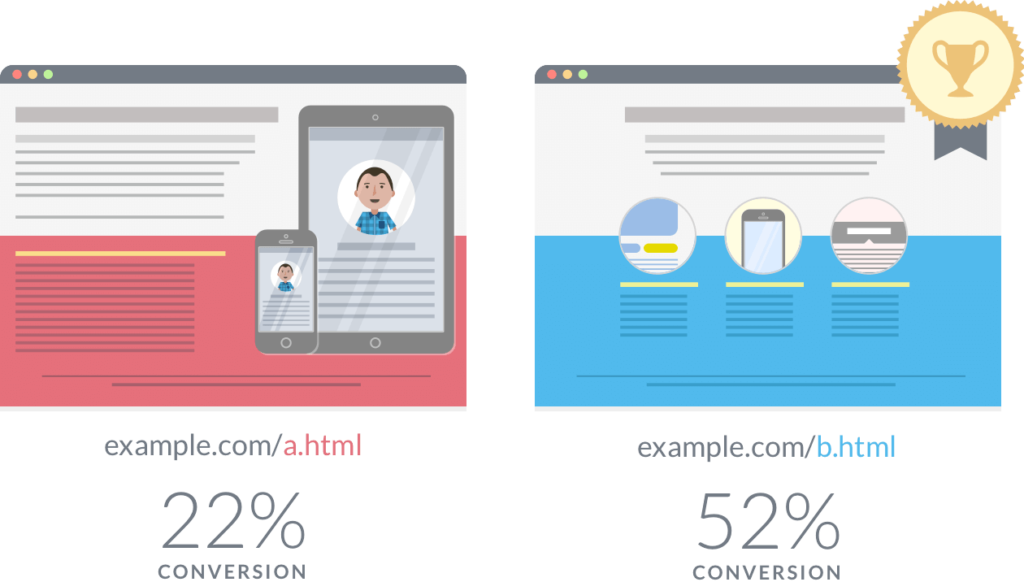
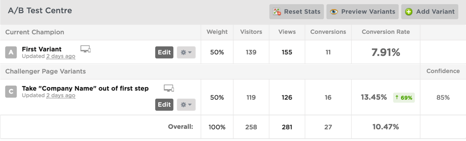
Here’s a split testing example from one of our clients below.
We were getting a lot of drop-off on the first step, so we moved the company name to the second step and this gave us a nice boost—69%. When a win like this happens, roll it out across your other pages and see if it helps.
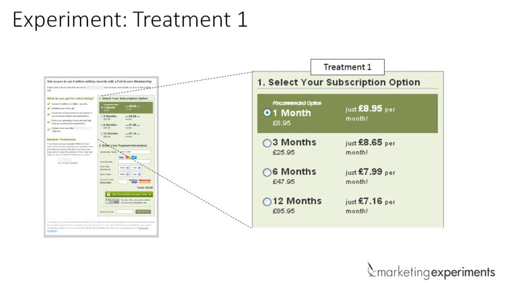
Before:
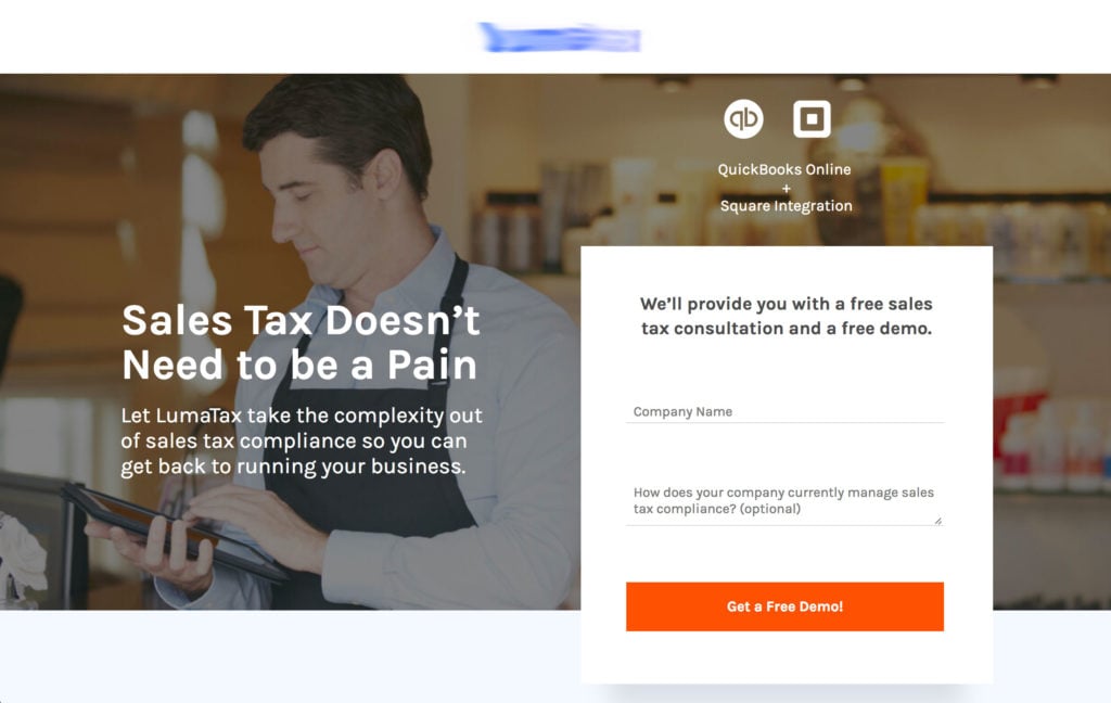
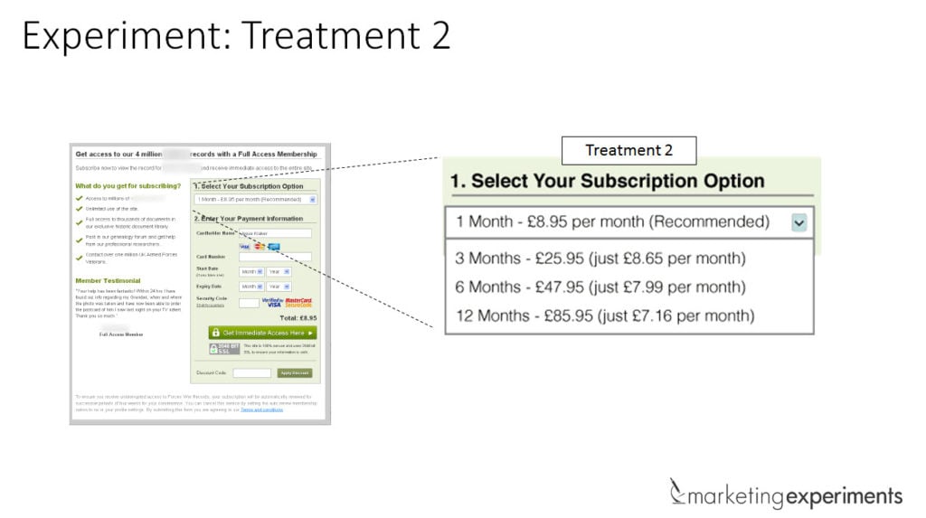
After:

The myth about split testing “bests”
There isn’t a sacred button color that produces the most conversions as we mentioned above. Nor is there an exact number of fields you should use on your form every time.
Split testing differs from test to test, ad to ad, page to page.
What works for some won’t work for others. Which means there isn’t really a “best thing” to test.
It depends on many factors including your demographic.
“If marketer 1 tested a red button against an orange one on her landing page, and found the red one to produce more conversions, then she’s correct about red being the right choice for her landing page. If marketer 2 tested a green button vs. a red one on his landing page, and he found green to beat red, then green is the right choice for him.”
—Ted Vrountas from Instapage
The impact of color on conversions depends on your audience for that specific test during that campaign. It also depends on the color of the rest of the page; maybe it was the contrast of a blue page with an orange button that created the conversion.
Again, what works for someone else may not work for you. That’s why all your tests should be based on the data you collect every 👏 single 👏 time 👏 you test an ad or landing page—for 👏 every 👏 single 👏 campaign (step 29).
👏 😂
What should you test on a landing page?
When it comes to landing page split testing, there are several elements you should test for better conversion rates.
Hero section
The hero section is the top of the page; it’s the first thing your leads see.
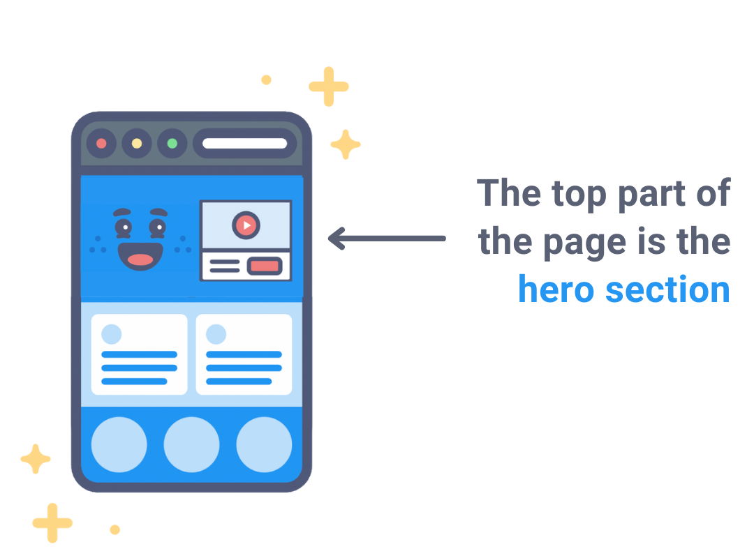
Generally, you’ll have your headline, subhead, and form if you’re creating a lead-gen page. But ask these questions (steps 30 to 34)
- Have you tried a different headline that better represents your unique value proposition (UVP)?
- What about switching the subhead and headline copy?
- A different hero image might get a better response than your current image (or a solid color or gradient)
- Is your form simple? Complicated forms scare people away
- Does your CTA contrast enough to get noticed?
CTA
Your call-to-action button (CTA) should be the hottest thing on your page (and you can figure this out with a heatmap).
If it’s not, ask these questions (steps 35 to 37):
- Do you use simple text on your CTA?
- Is the offer clear? (do customers know exactly what they’ll get if they click that button?)...or does it say SUBMIT? 👈 😣
- Does it stand out against the background?

Looking for more call-to-action examples? Here are 61 of them you can’t help but click (step 38).
Form
If you have a lead gen page, we strongly suggest using a form that has more than one step. They simply work better than a long-ass intimidating block of fields.
Follow steps 39 to 44:
- try removing fields by moving them onto subsequent steps of your form.
- Start with low-threat questions
- Have you tried asking for zip code vs state & city?
- Have you updated the copy of your form to explain to the user what they’re going to receive in this demo, trial, free guide?
- Limit dropdown options because choice is scary
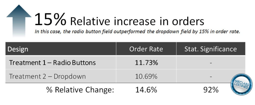
- Use radio buttons (that don’t hide information) over dropdowns (that do)
Split testing example of radio buttons vs. drop-down menu:
You can test a sticky form that scrolls as the user scrolls down the page, or you can try a stationary form that lives at the top or bottom of the page, with additional CTAs that scroll to the form when clicked (step 45).
Social proof/testimonials
Adding social proof to a page can really boost conversions because it adds legitimacy to the brand or product (steps 46 to 50).
Consider your audience
Who are you trying to sell to?
Use your social proof to showcase your big business clients, small business clients, or a mix of both.
How many testimonials do you have?
Is one testimonial enough to seal the deal? Would three quotes be better? Or, say, thirty?
Do you have quality testimonials?
Look at your current testimonials. Are they short and vague along the lines of “Great stuff! Would recommend.” Or are they in-depth and cover the customer’s problem as well as the solution your business provided in a professional and helpful way? 👈 Ask for this.
Add a headshot
And when you get a testimonial, put a name and a face on it.
A quote from a nameless, faceless somebody could do more harm than good because the legitimacy is missing—your prospects might call bull. Your customers put weight behind real, legitimate testimonials.
So make them real.
Take your testimonials next-level
Take this one step further and use video testimonials if you have them. It doesn’t get more real than watching the actual customer speaking about why they value the product or service you provided for them and how it helped them reach their goals.
The offer
When all else fails, go back to the drawing board and change your offer.
- If you’re offering a free trial, but the temperature of your traffic is a little bit colder (they want more information first before signing up), consider giving a free demo instead of a free trial (step 51)
- An even lower ask is gated content: Do you have any free guides, ebooks, or case studies about your service that you can give away in exchange for a name and email address? (step 52)
Split test your versions to get more conversions
Running split tests is a must-do thing in marketing. Knowing what version plays best with your crowd means capturing the most qualitative opportunities from your crowd.
Use split testing tools like Hotjar to gather data on what’s popular and create a lift in your conversion rates.
Follow best practices, but remember that what works for one company may not work for you. With enough research and time, followed by analysis and testing, you should start to see more traffic, more conversions, and ultimately more sales.
And if you liked the sound of multivariate testing, we talk all about that in our next post.


