


A click-through page is exactly what it sounds like: a doorway that someone needs to pass through before converting.
What’s their purpose? To warm up your prospects with persuasive copy and entice them to click on a call-to-action that leads to an immediate conversion. Simple.
But how do they differ from other landing pages? What separates a good click-through page from a bad one? And where do they fit within your sales funnel and marketing strategy?
In this article, we’re going to provide answers to those questions plus the following:
- What is a click-through page?
- The difference between a click-through page and a lead gen page
- Click-through landing page best practices
- Case study of an actual click-through page (from Jarvis)
- 13 beautiful click-through page examples and highlights
- Full-page screenshots that you can use as inspiration
- What is a click-through landing page?
- Click-through pages vs. lead generation pages
- Anatomy of a high-converting click-through page
- 13 click-through page examples
- 1. Editor X (Wix)
- 2. Canva
- 3. Unbounce
- 4. Norton
- 5. Moz
- 6. HotJar
- 7. InvisionApp
- 8. Monday
- 9. Keeps
- 10. Adobe (Creative Cloud)
- 11. Dollar Shave Club
- 12. Allure Beauty Box
- 13. SEMRush
- Key takeaways
Get brand new landing page strategies straight to your inbox every week. 23,739 people already are!
What is a click-through landing page?
A click-through page is a landing page that features a clear and compelling call-to-action (CTA) that takes visitors to another page (i.e. clicks through) once clicked on.
Click-through landing pages don’t ask for lead information via a form (like a lead capture page does). In fact, they don’t even include forms. Instead, their primary goal is to direct visitors to a page where they can complete their conversion instantly.
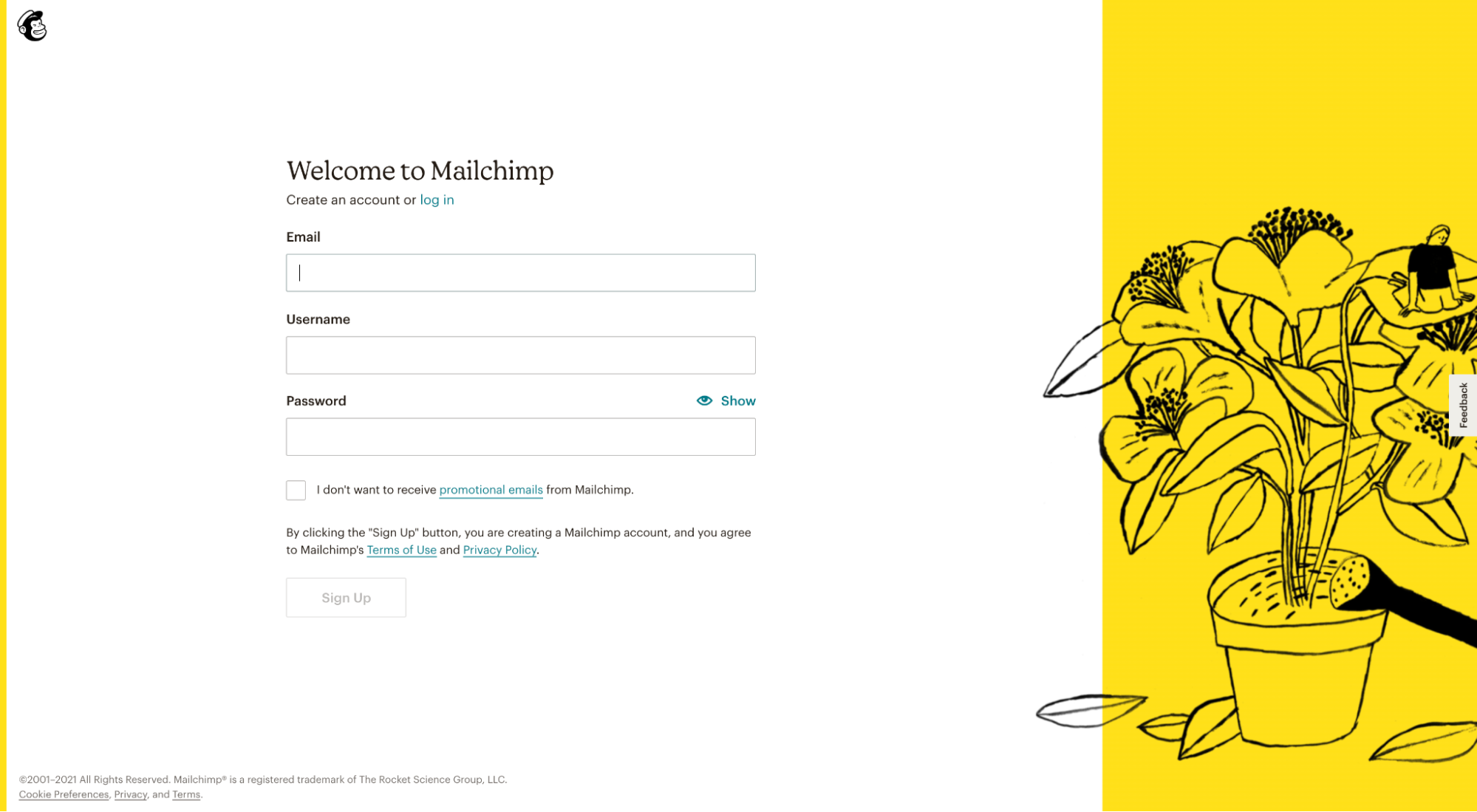
For example, this MailChimp click-through landing page promotes their new website builder, and it includes a single offer (“Start building for free”) with CTA. When you click on the CTA button, it “clicks through” to the account creation page where visitors can start their trial immediately:
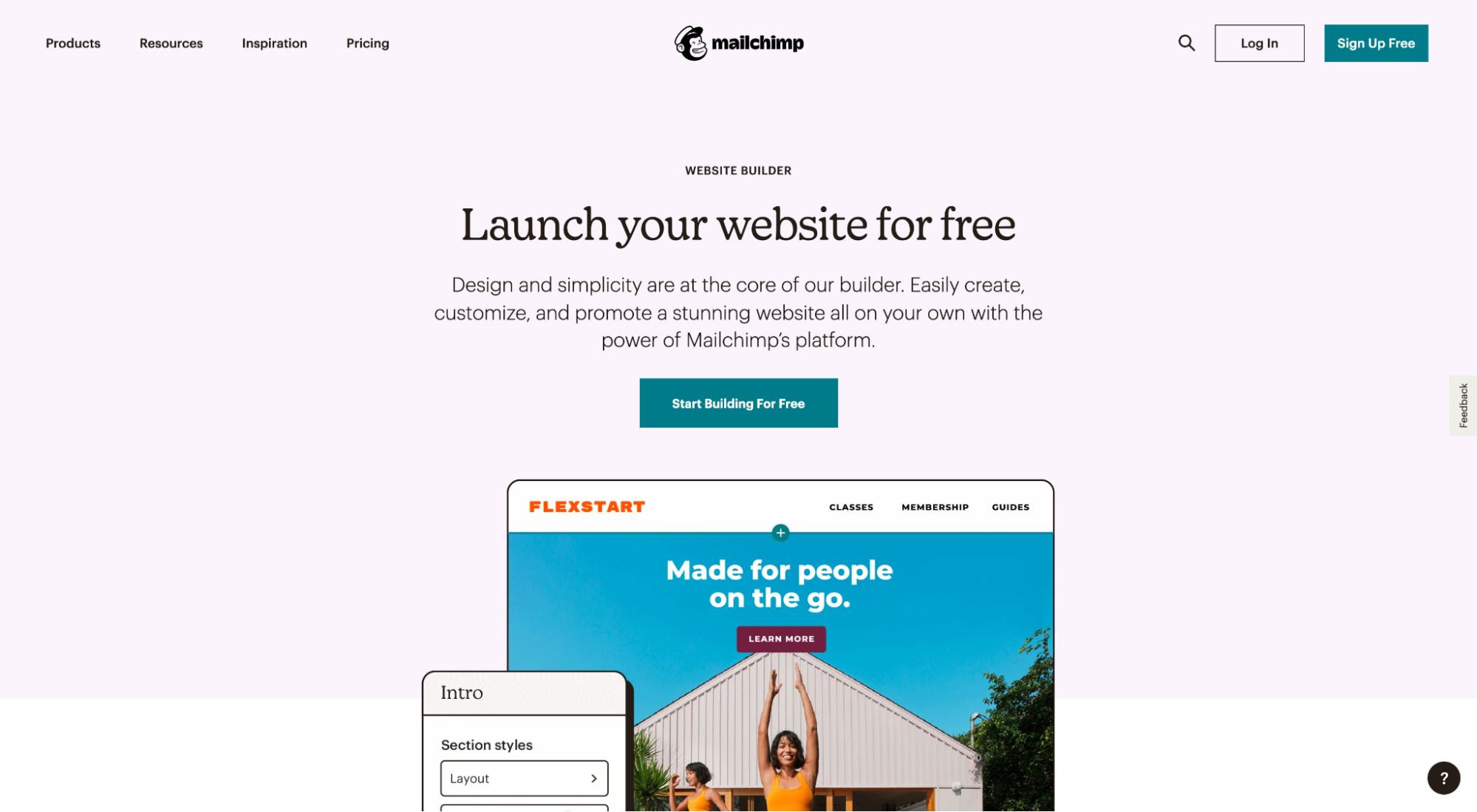
Since a click-through page’s sole purpose is to get visitors to click through to complete a goal, more often than not they get used for bottom-of-funnel offers where people can convert instantly, like eCommerce purchases or SaaS free trials.
But there are no rules. You can use a click-through page for the top of the funnel offer as well, like a free ebook download or demo.
Click-through pages vs. lead generation pages
Landing pages come in all shapes and sizes, but no matter their style or purpose, you can break them up into two categories or broad types of landing pages:
- Click-through pages
- Lead capture pages (led gen page)
How do they differ?
Unlike a click-through page, a lead generation landing page is designed to capture lead information so a salesperson can follow up and close the sale. Hence the name, lead generation.
The primary distinction between the two is that a click-through page links to a click-through destination page where visitors can convert immediately, and a lead capture page includes a form to capture leads that sales can follow up with later.
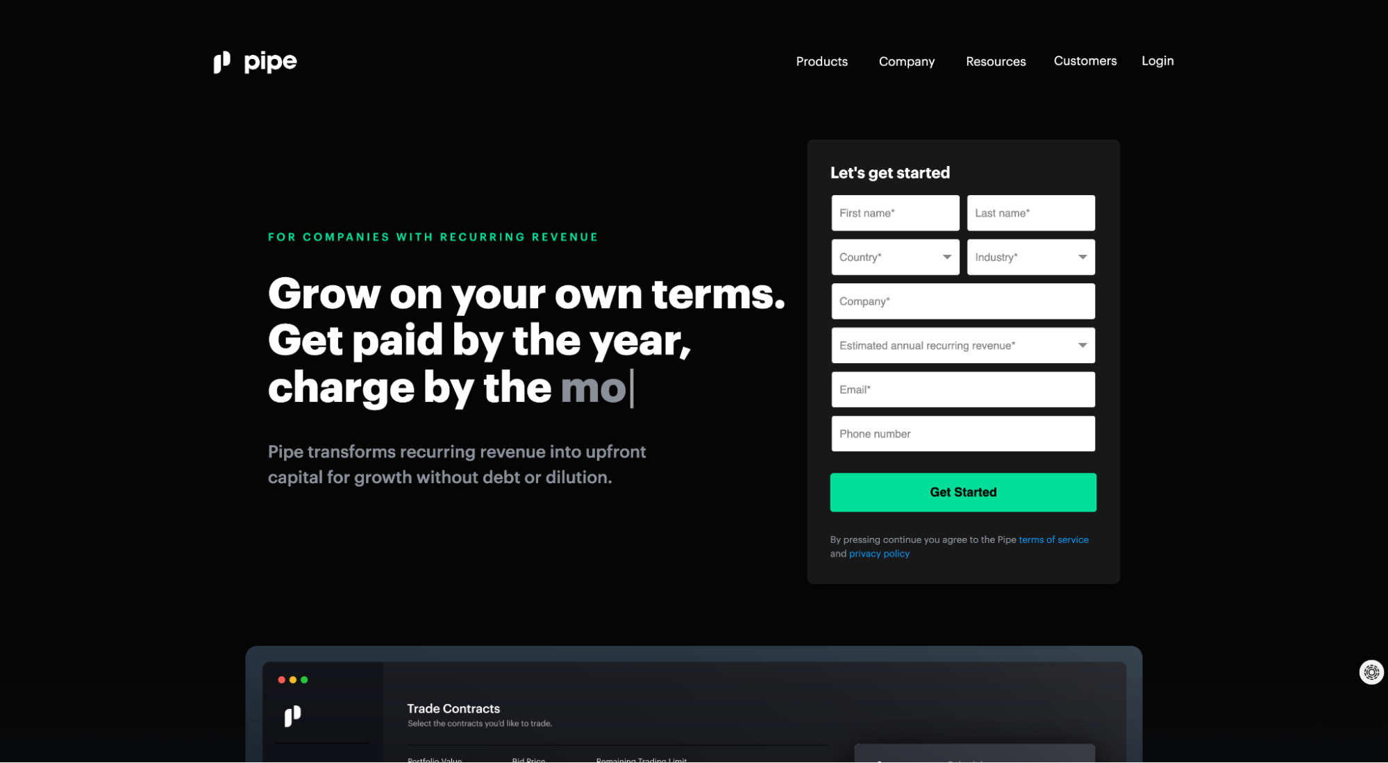
For example, below is a lead capture page from Pipe. Since prospects need to speak with sales before receiving a customized pre-approval, Pipe uses a lead capture form to generate leads.
Further reading: Lead Capture Page: Definition, Examples, Best Practices
Anatomy of a high-converting click-through page
Every high-converting click-through page includes a handful of critical elements that work together to convert visitors, including:
- Attention grabbing headline
- Enticing subheadline
- Engaging product video or hero shot
- Persuasive copy (features/benefits)
- Social proof
- Irresistible offer
- Compelling call-to-action (CTA)
- Optimized click-through destination
This list is by no means exhaustive but think of each element like a piece of conversion gold. The more of each you can sprinkle on your click-through landing page design, the higher it will convert.
To help you understand each element, we’re going to deconstruct and analyze an actual click-through page that showcases them all.
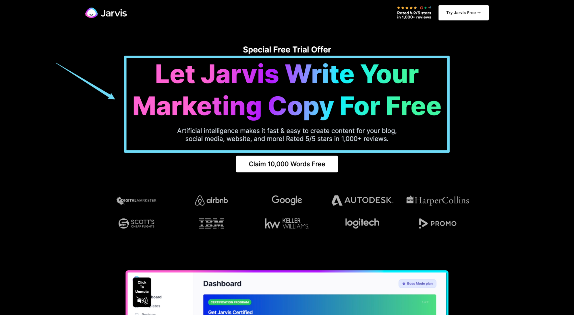
Enter: Jarvis.
Jarvis is an AI-powered writing tool that uses machine learning to help you write blog posts, marketing copy, sales emails, and even books. It’s like automation for your words.
The example we’re about to explore puts on a clinic in how to design a high-converting click-through page.
P.S. To view the full Jarvis click-through page, click here.
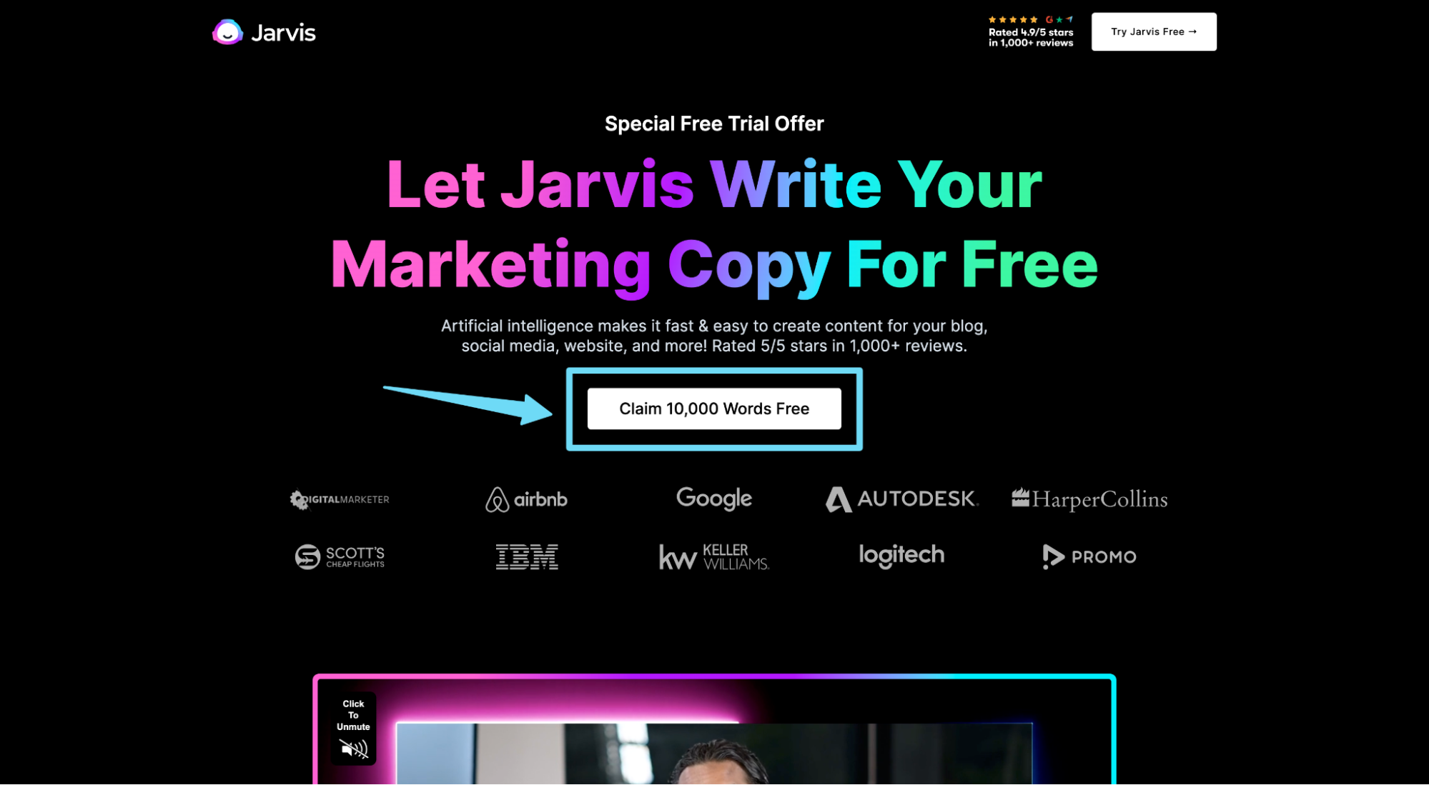
Attention-grabbing headline and subheadline
Your click-through page’s headline and subheadline should work together to capture attention, empathize with your target audience, and deliver your value proposition in as clear and concise a manner as possible.
What’s the problem your product solves? And who does it solve it for? That’s your headline.
Jarvis delivers an opening headline that speaks to their target audience’s (marketers) pain points and delivers their benefit in a straightforward, easy-to-understand way.
“Let Jarvis Write Your Marketing Copy For Free.” Ok, I’m listening.
Jarvis uses their subheadline to explain how they’ll deliver their value proposition (artificial intelligence), then ices the cake with social proof (“5/5 stars in 1,000+ reviews”).
Absolutely textbook.
Further reading: Landing Page Headlines That Convert Up To 67.8% Better
Product video
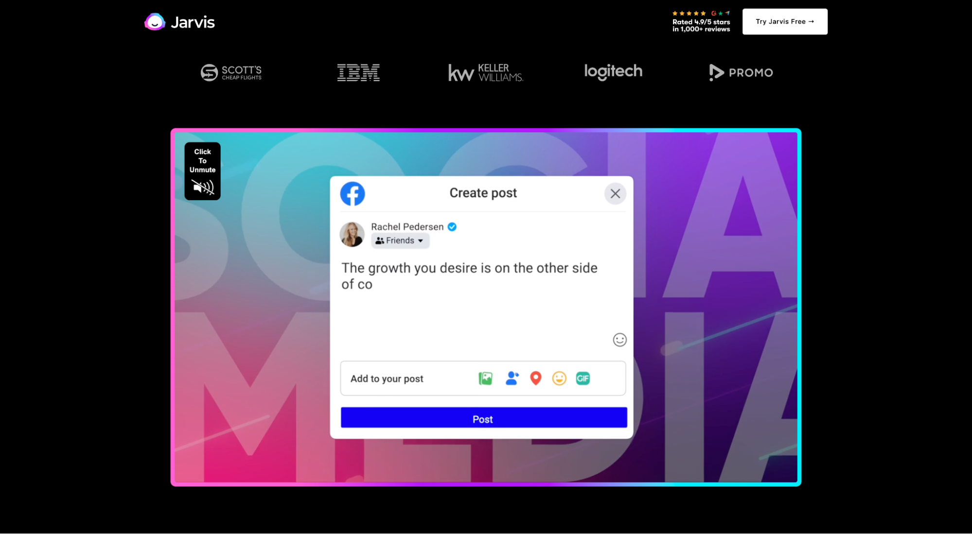
Some click-through landing pages use hero shots (contextual graphics), others use video backgrounds, and still others (like Jarvis) use product videos as their primary visual element.
Why do product videos matter? Because including a video on your click-through page can increase conversions by up to 80%.
In this video, Jarvis spends less than two minutes exploring the features and benefits of Jarvis AI, along with a deep dive into how the platform works, real-world examples, client testimonials, and more.
There’s no better way to build trust, handle objections, and sell the invisible (the parts of your product or service prospects can’t see) than by packaging your offer into a captivating video.
Further reading: Landing Page Video: 22 Rules For Top Video Creation
Strong copywriting
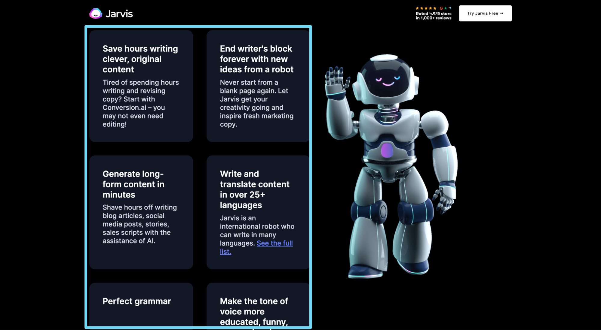
Strong copy does the work of a thousand salespeople—but only when it communicates the benefits your target audience can expect to achieve, and does so in a conversational, jargon-free way.
Therefore, the highest-converting click-through pages use their copy to sell the outcome their potential customers want to achieve, not the features that will help them achieve it.
For example, Jarvis doesn’t belabor features like AI, templates, or translation; they talk about boosting ad campaign ROAS, saving hours writing blogs, ending writer’s block, perfecting grammar, manipulating your tone and voice, breaking through language barriers, and scaling your marketing campaigns.
Further reading: How to Write Amazing Landing Page Copy
Social proof
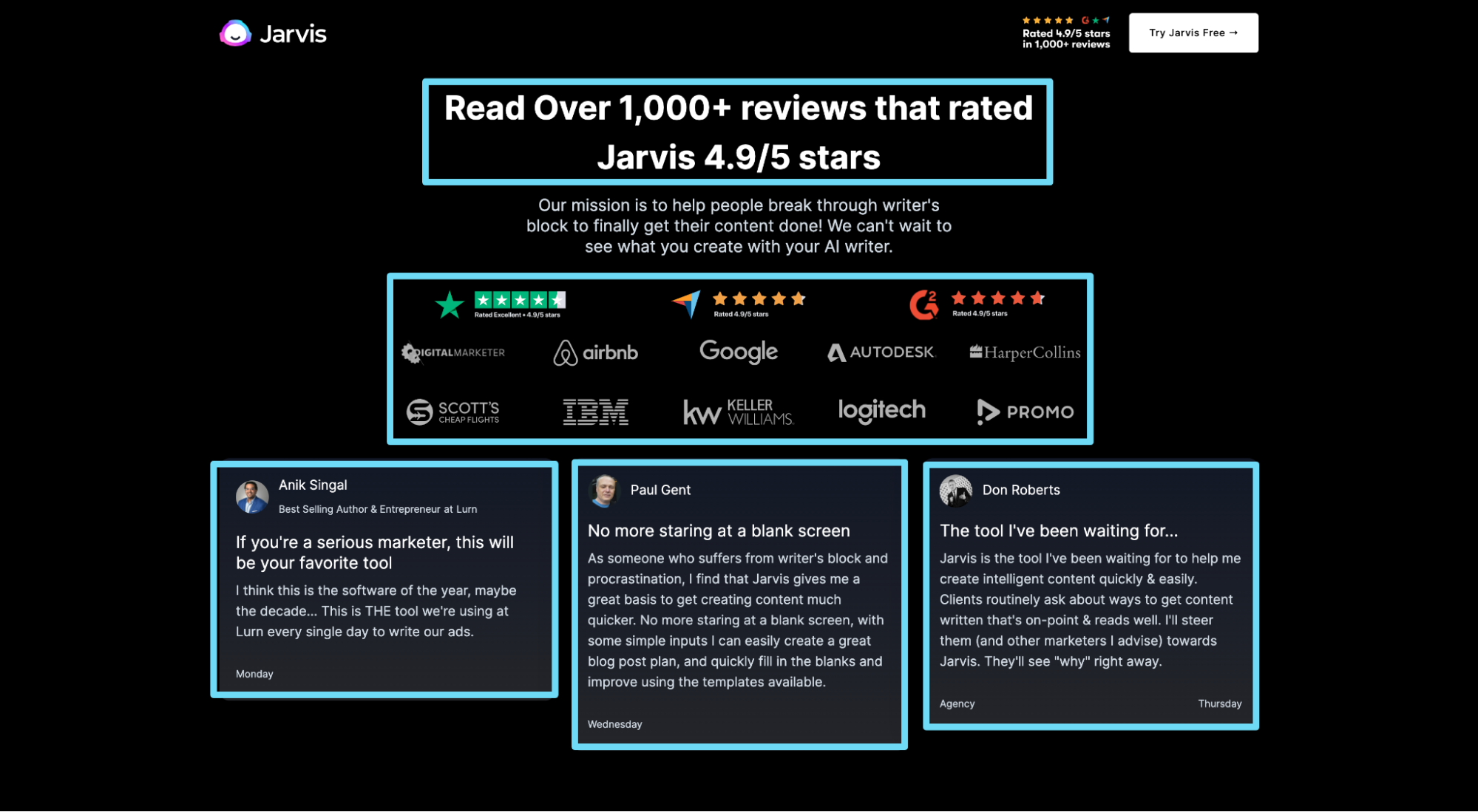
Social proof is any form of third-party clout given to your product or brand, like testimonials, review ratings, or awards. It can also include user stats (“125,000 business use XYZ”), client results (“Over $1B earned”) or client logos.
Why does your click-through page need social proof? Buyer psychology.
- 93% of consumers use online reviews when dealing with brands they don’t know well
- 55% of consumers consider online reviews to be “very helpful” in their purchase decision
- 66% of consumers will most likely buy a product because of its positive reviews
Jarvis absolutely crushes their social proof with five different types:
- Client logos from some of the biggest brands in the world (Google, AirBnB, IBM, etc.)
- Star ratings (“4.9/5 stars from over 1,000+ reviews”)
- Testimonials (100 total)
- Customer stats (“Over 55,000 customers”)
- Authors who have published books using Jarvis
Further reading: 22 Ways to Use Landing Page Testimonials and Social Proof
Irresistible offer
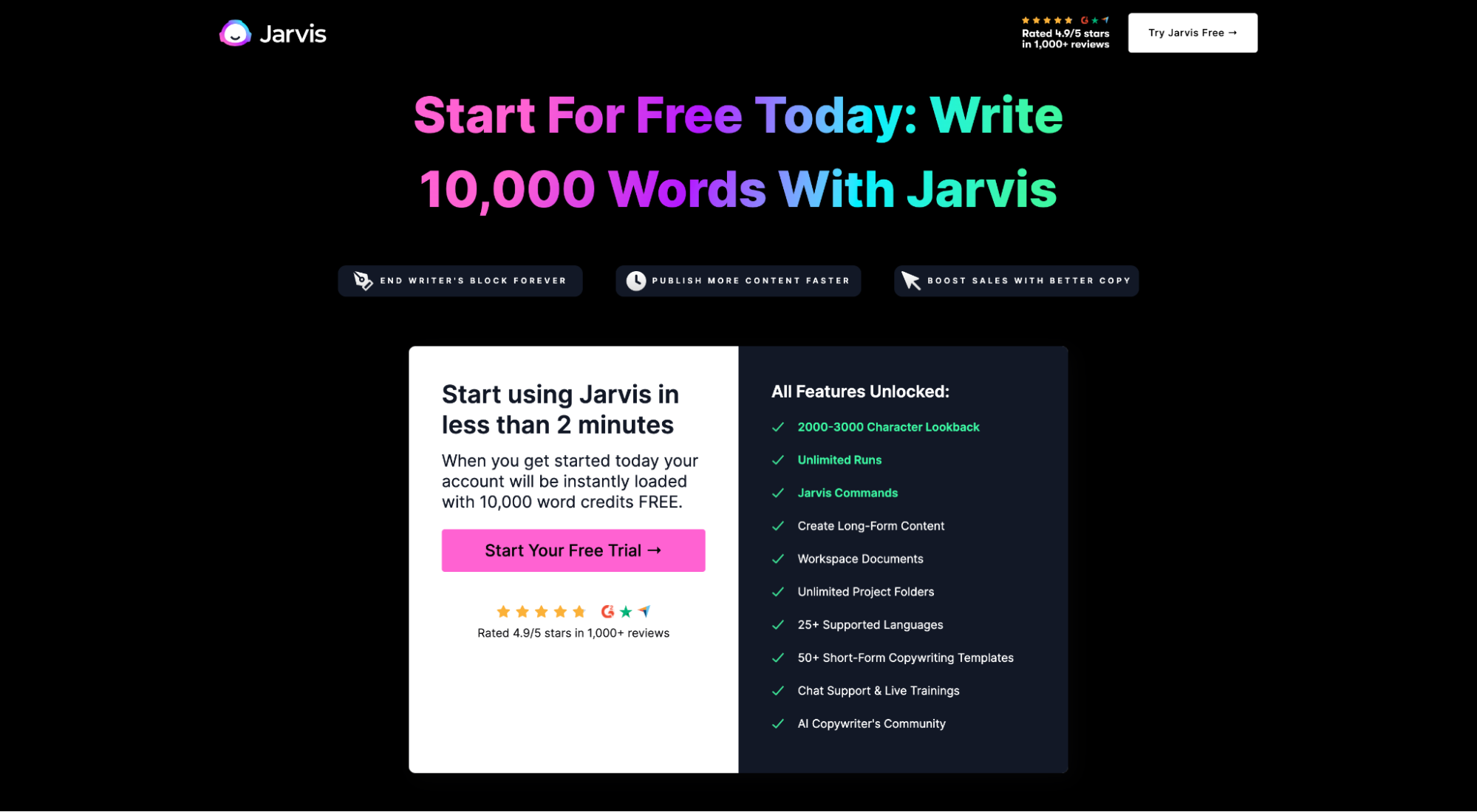
The success of your click-through page hinges on the offer.
Even the best copywriting can’t save a poor offer.
Let us be clear. Everything from social proof and features/benefits to product videos and CTAs help to create your offer and make it more compelling. But when we talk about crafting an irresistible offer here, we’re talking about what your prospects actually get for clicking-through.
Jarvis makes a concrete offer that’s hard to refuse: Write 10,000 words with Jarvis for free. Then they support that offer with “unlocked features” and the assurance of efficiency (“Start using Jarvis in less than 2 minutes”).
It checks all the boxes of a compelling offer:
- Crystal clear (concrete offer, no ambiguity)
- Risk free (100% free)
- High perceived value
- Assurance of immediate gratification
And only include one offer.
Why? Because click-through pages with only one offer convert higher than web pages with multiple offers. Adding multiple offers can decrease conversion rates by 266%.
Single call-to-action (CTA)
Every click-through page should feature a strong CTA that answers the question, “Why should I click on this button?”
Do you want your visitors to “submit”? Or do you want them to “Claim 10,000 Words Free”?
Like Jarvis, make your CTA buttons more clickable by including a benefit within the copy.
In the Jarvis example, they use four different versions of call-to-action button copy, but each button does the same thing (starts a free trial):
- Claim 10,000 words free
- Try Jarvis free
- Start your free trial
- Get started
Further reading: 38 Proven Ways to Create the Strongest Call To Action Copy
Optimized click-through destination
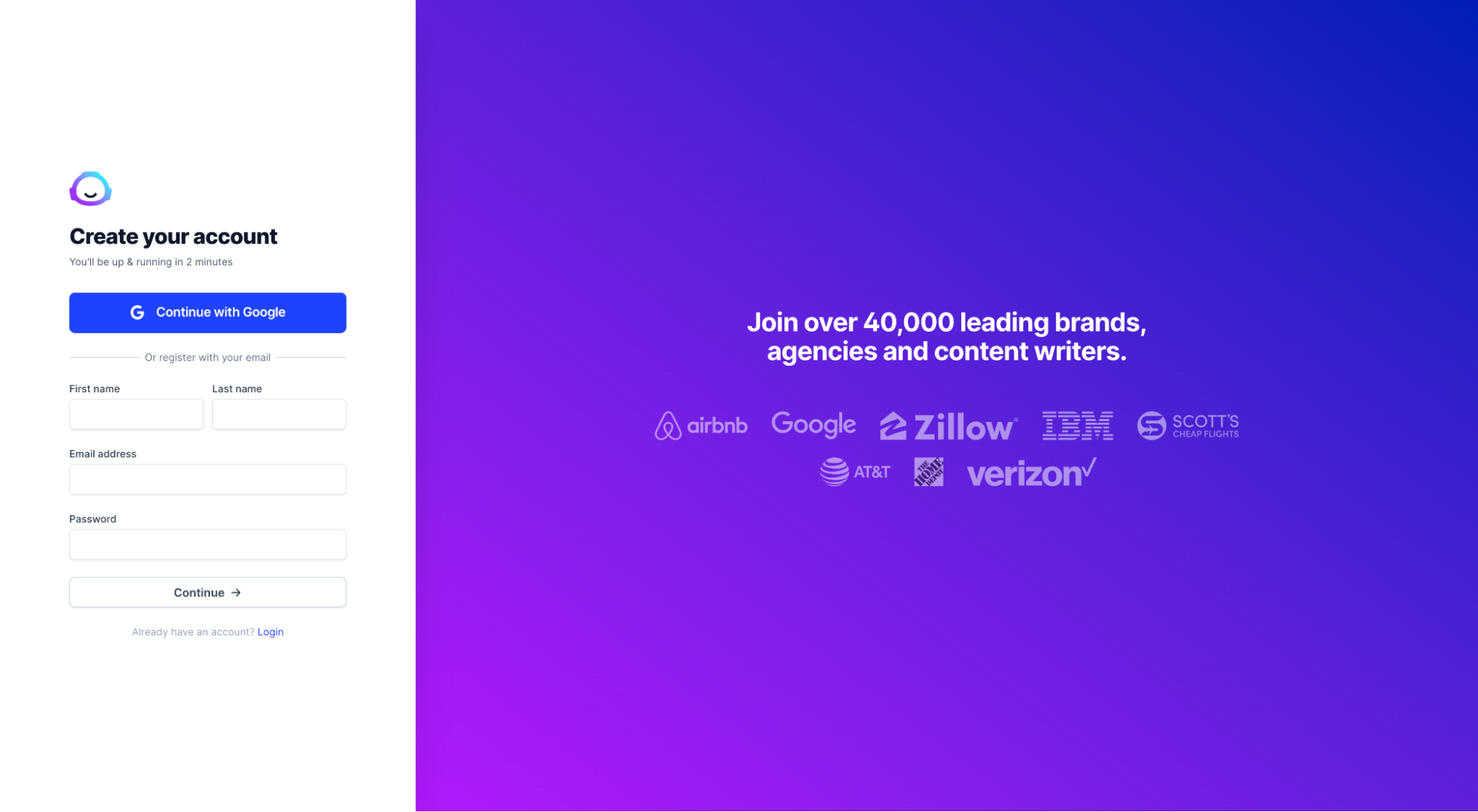
Last, and certainly not least, is the click-through destination.
In other words, when someone clicks on the button within your click-through page, where does it take them?
The truth is that most businesses overlook the click-through destination. But they shouldn’t, because another page means another conversion opportunity (or conversion lost opportunity). At the very least, include social proof on your click-through destination.
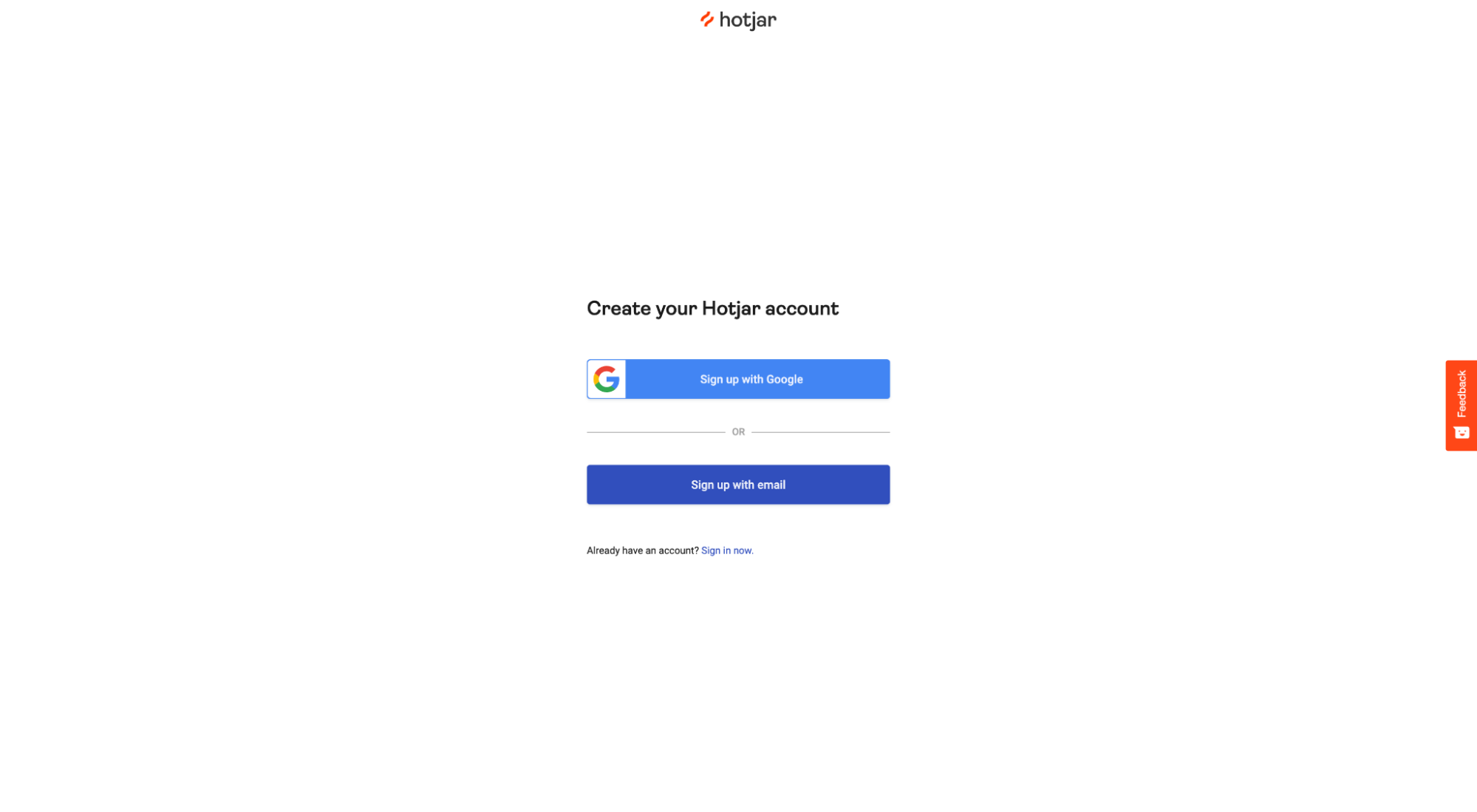
For example, on Jarvis’ click-through destination (free trial page), they not only make starting a free trial easy with a short form (or a Google login), but they also include social proof: 40,000 leading brands + client logos. That’s how you remind prospects to keep moving forward.
13 click-through page examples
Now that you know what a high-converting click-through page looks like (thanks, Jarvis), let’s explore more examples.
Jarvis checked all the boxes, but we found 13 more click-through page examples that show off their own morsels of conversion gold (some that even Jarvis left out).
Each example includes a link to the full page lander (so you can view it even if they take it down), along with a screenshot of the click-through destination page and an overview of our favorite feature.
- Editor X (Wix)
- Canva
- Unbounce
- Norton
- Moz
- HotJar
- InvisionApp
- Monday
- Keeps
- Adobe
- Dollar Shave Club
- Allure Beauty Box
- SEMRush
Let’s explore each.
1. Editor X (Wix)
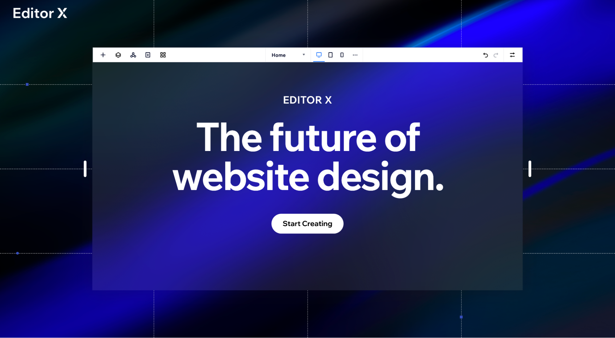
What we love: Conversion design
Editor X is Wix’s latest advanced editor (and it’s brilliant). What’s even more brilliant is how they communicate their value proposition using just a few powerful images and less than 45 words. Everything leads to one goal: start creating. This click-through page checks all of the boxes of a high-converting lander, but does it with a level of simplicity only the sophisticated can pull off.
2. Canva
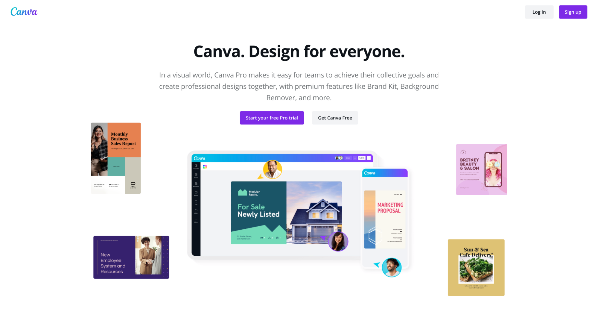
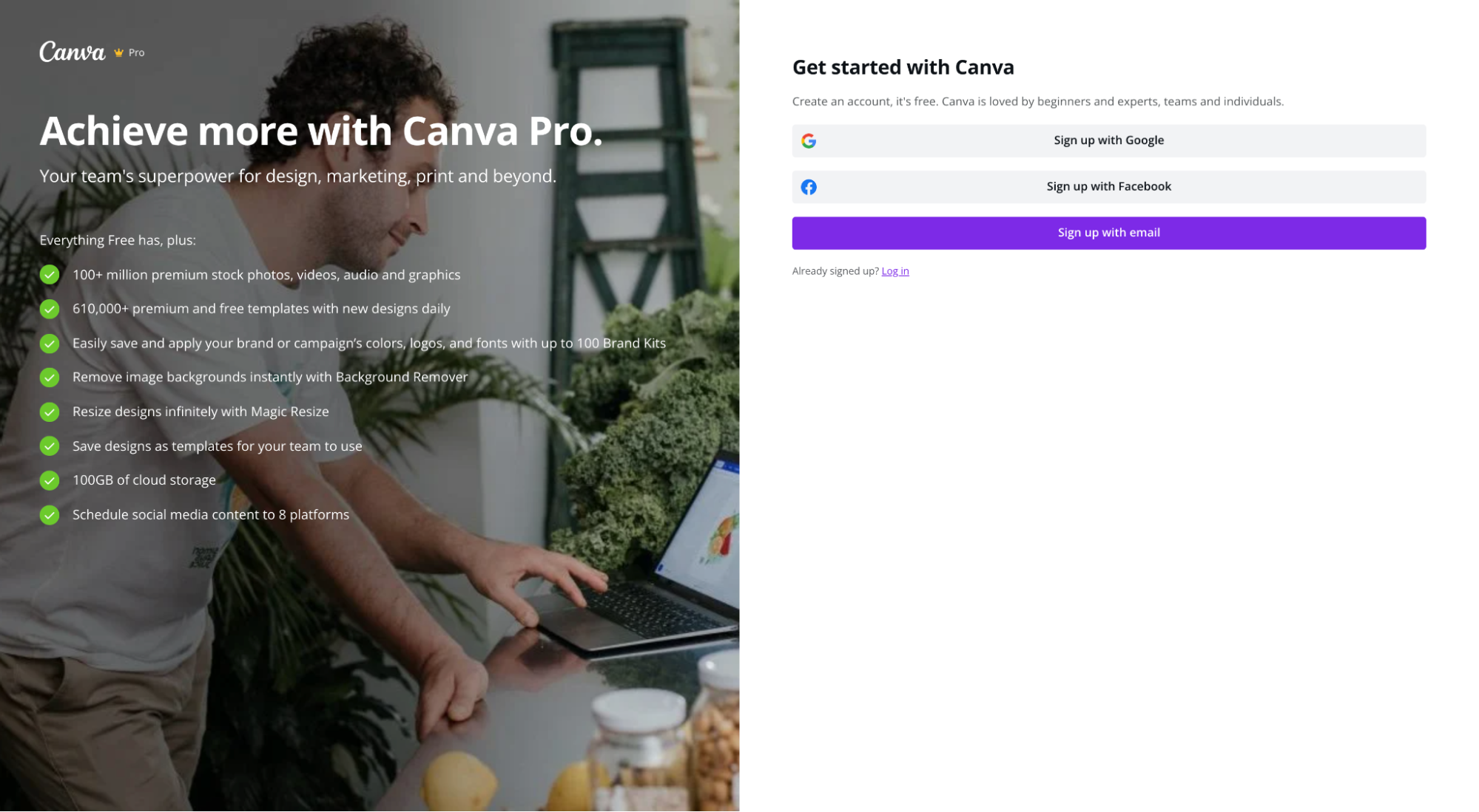
What we love: Focus
Besides the CTA, the only other links you can click on within this click-through page is the logo and the support link. No navigation links. No footer links. No exit links within the body. That’s how you keep visitors laser-focused on your offer: eliminate any and all distractions.
3. Unbounce
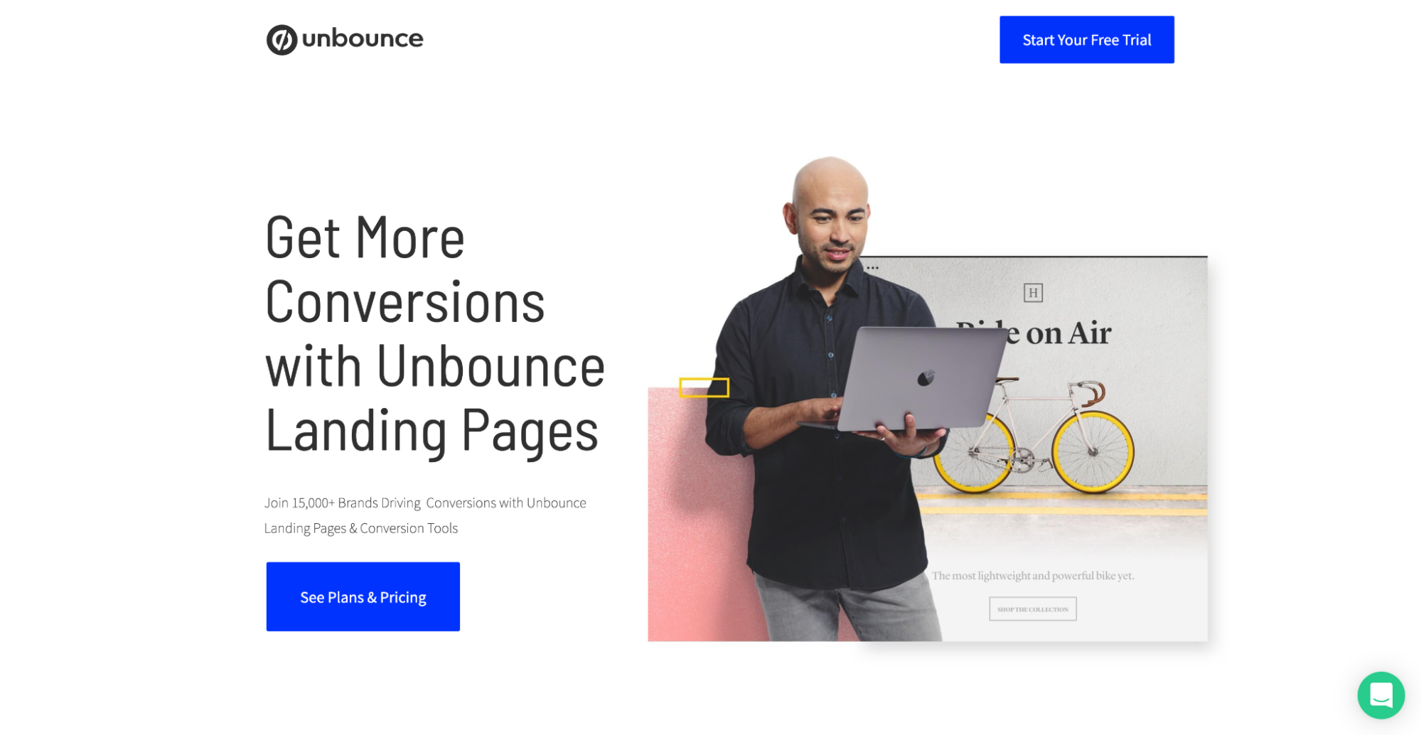
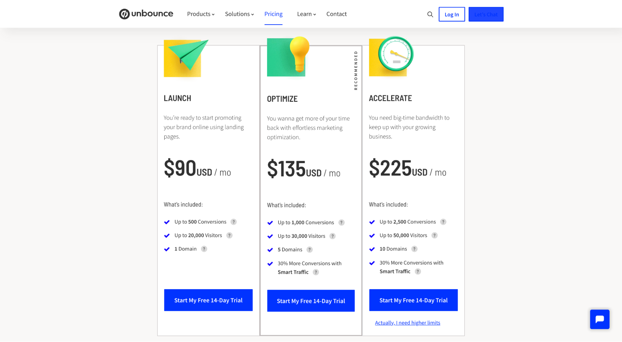
What we love: Copywriting
Short on features, long on benefits. This is the way.
4. Norton
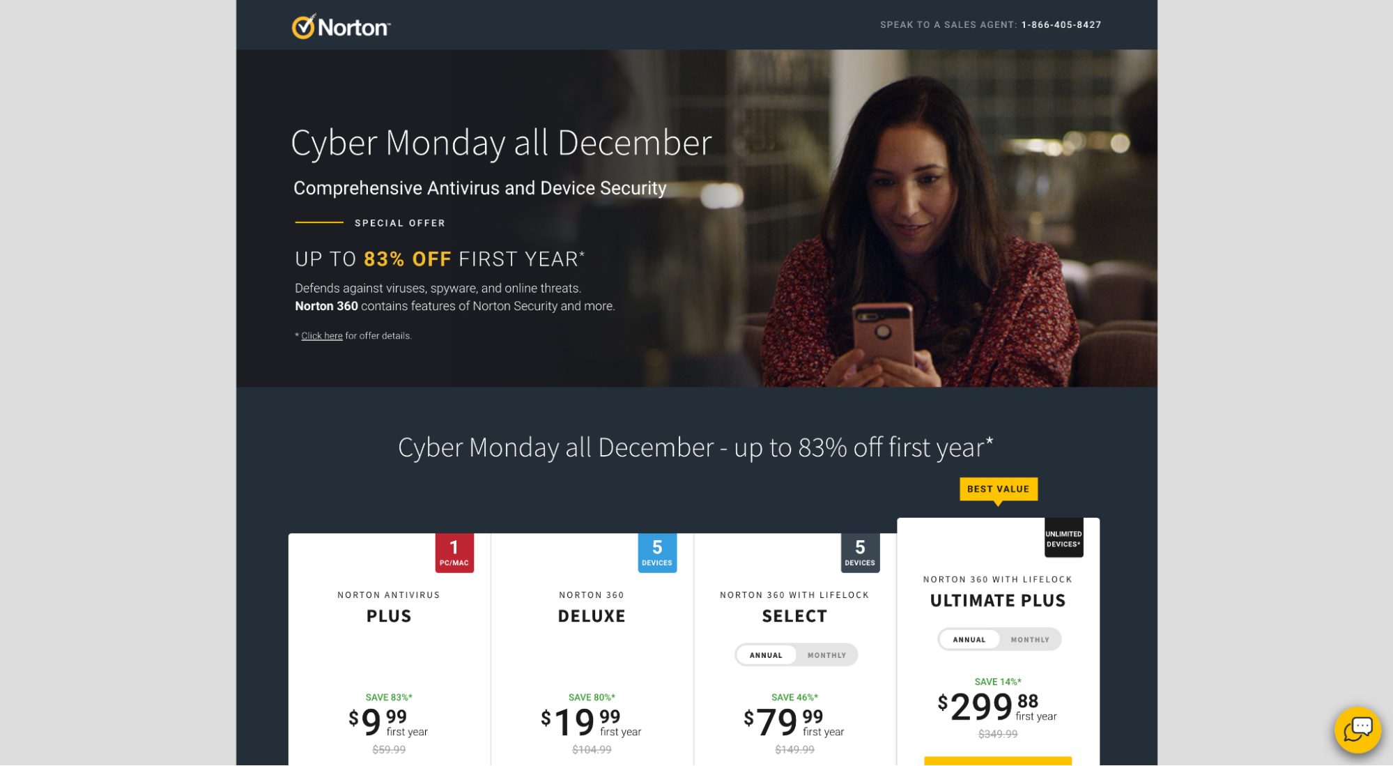
What we love: Feature comparison
Raise your hand if you’ve ever seen a comparison grid that’s long on features, short on any context or meaning? Yup, all the time—but not with Norton. Their feature comparison chart not only compares the features of each software option, but they provide an expandable drop-down button that explores the benefits of each feature too. Benefits over features. That’s good copywriting.
5. Moz
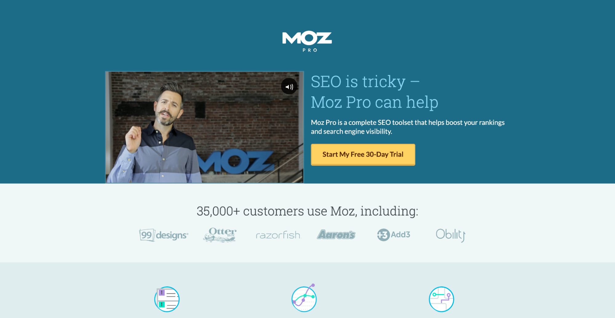
What we love: Product video
Yup, Rand Fishkin. Though he no longer sits at the helm of Moz, Rand is still one of the most recognized faces in digital marketing and SEO, and he’s the face and voice of their product video. It’s not the most riveting product video, but it concisely explains the product and delivers Rand’s official endorsement. Win-win.
6. HotJar
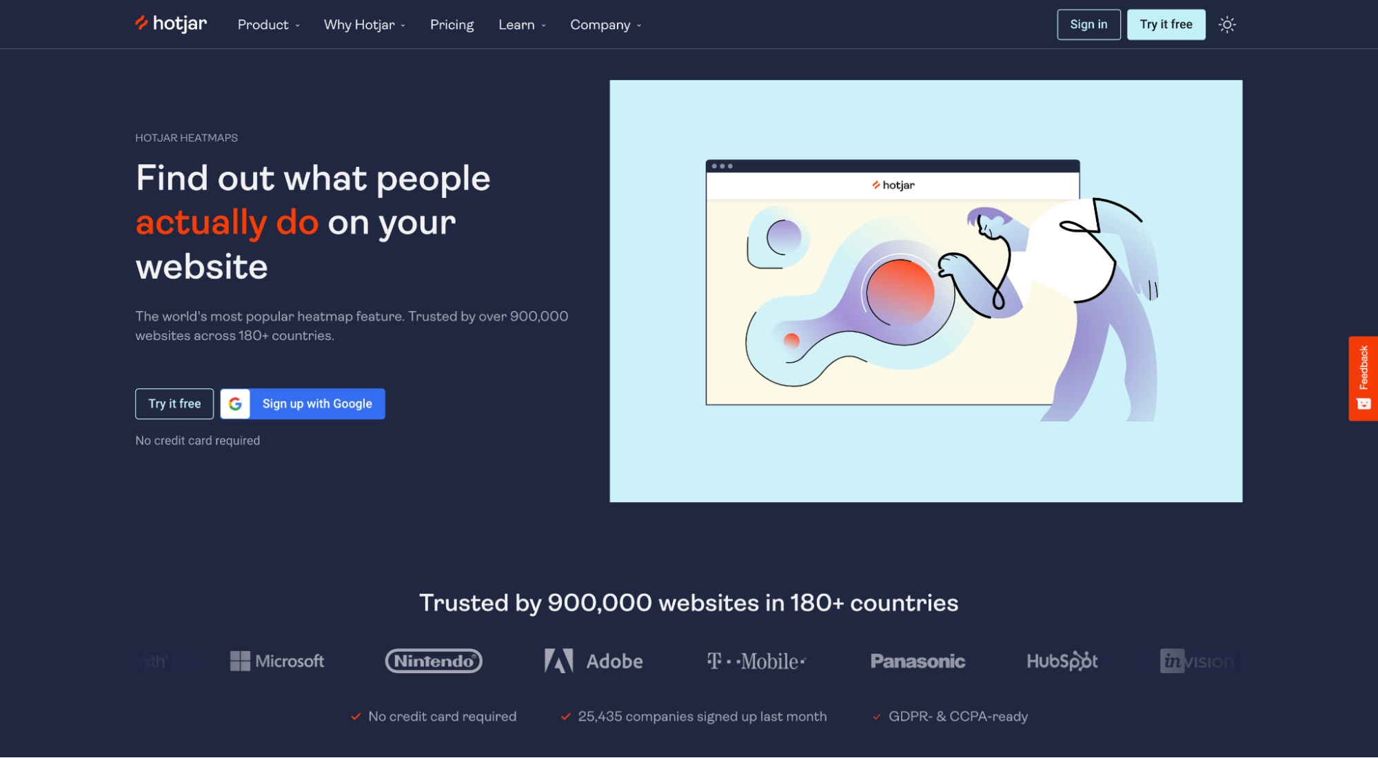
What we love: Product demo
What’s the fastest way to get your product in the hands of your prospects? Embed a live demo on your landing page. HotJar embeds a real-time, interactive heatmap demo of their pricing page, directly within their click-through lander. Not only can you see exactly how the tool works, but you can also download the data and a heatmap image jpg.
7. InvisionApp
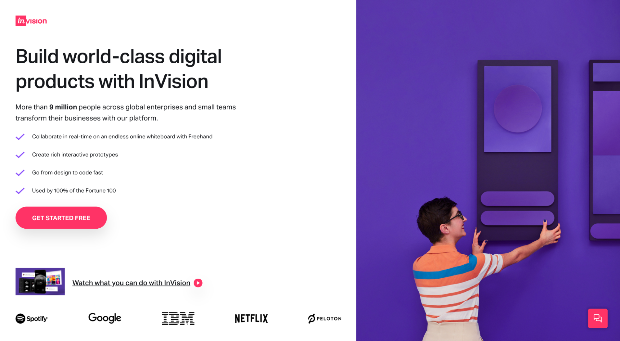
What we love: Above the fold
Who said you need more than a hero section to deliver your offer? InvisionApp packs an attention-grabbing headline, product video, product benefits, social proof, hero image, and compelling CTA all within the hero section (top of the page; no scrolling required).
8. Monday
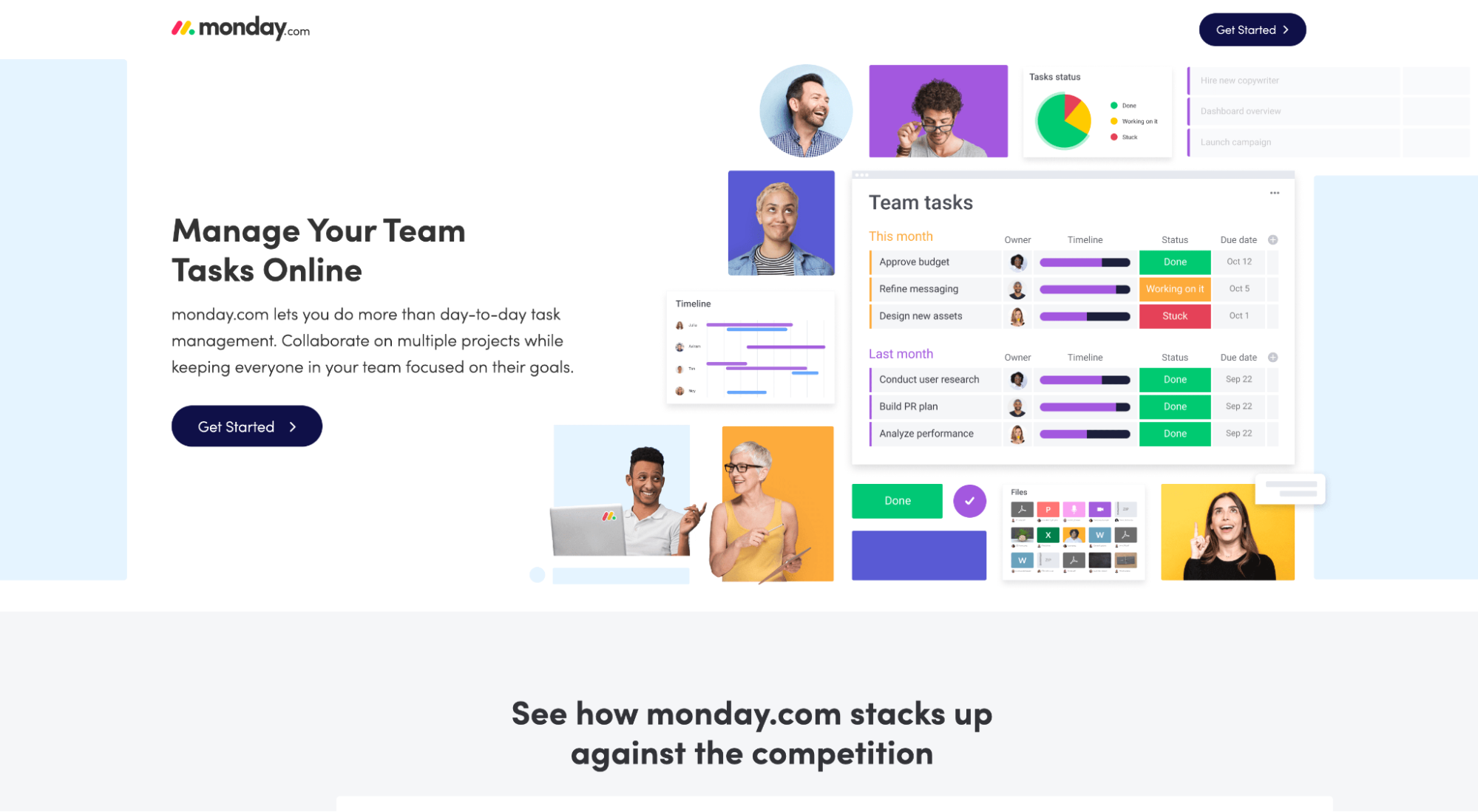
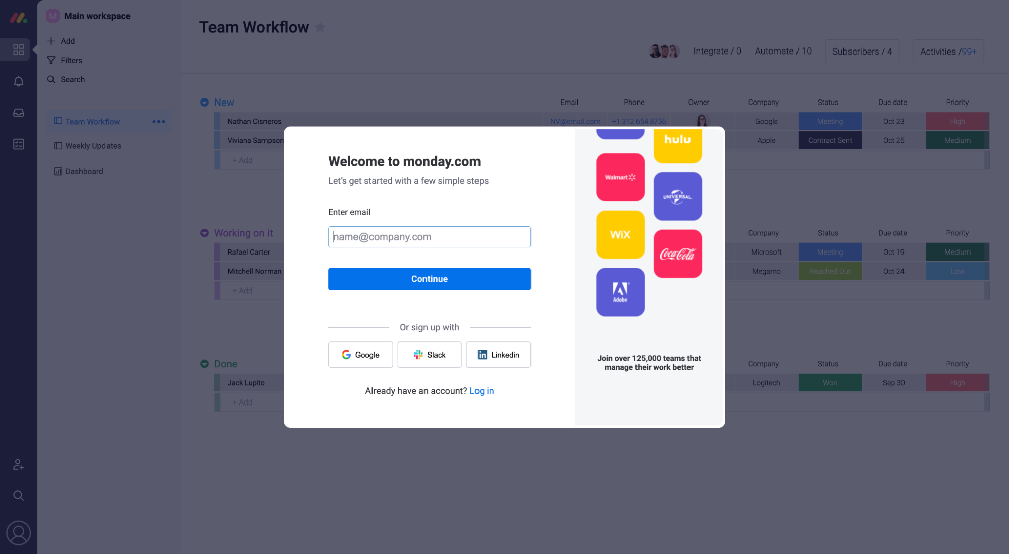
What we love: Click-through destination
Monday’s click-through destination (account creation page) uses a single field opt-in form (email only) and provides social proof in the form of client logos. But it does something else that’s subtle and brilliant and that no doubt leads to more conversion: it loads the actual software dashboard behind the account creation box for everyone to see. How can you not keep going? Curiosity alone will compel you.
9. Keeps
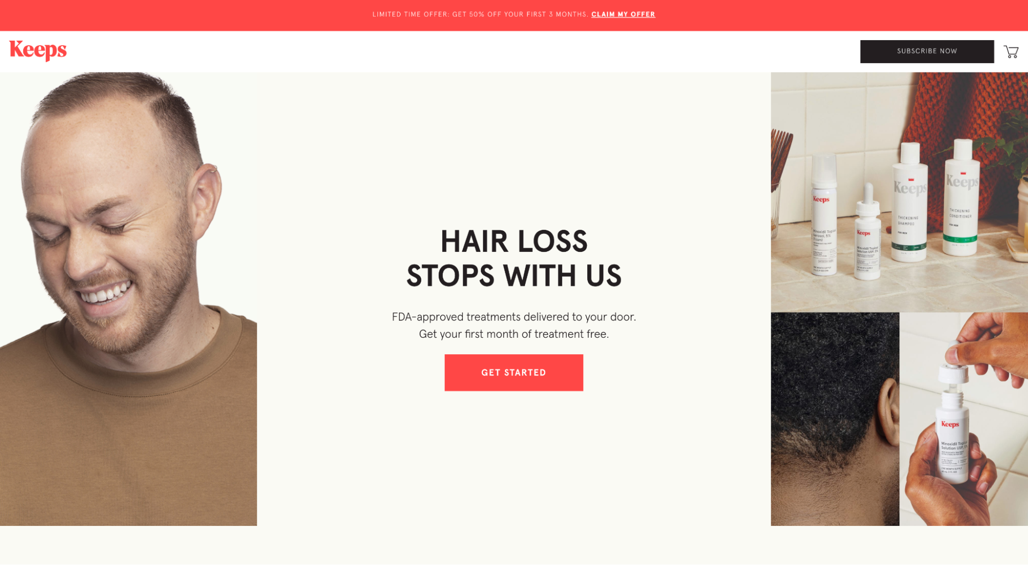
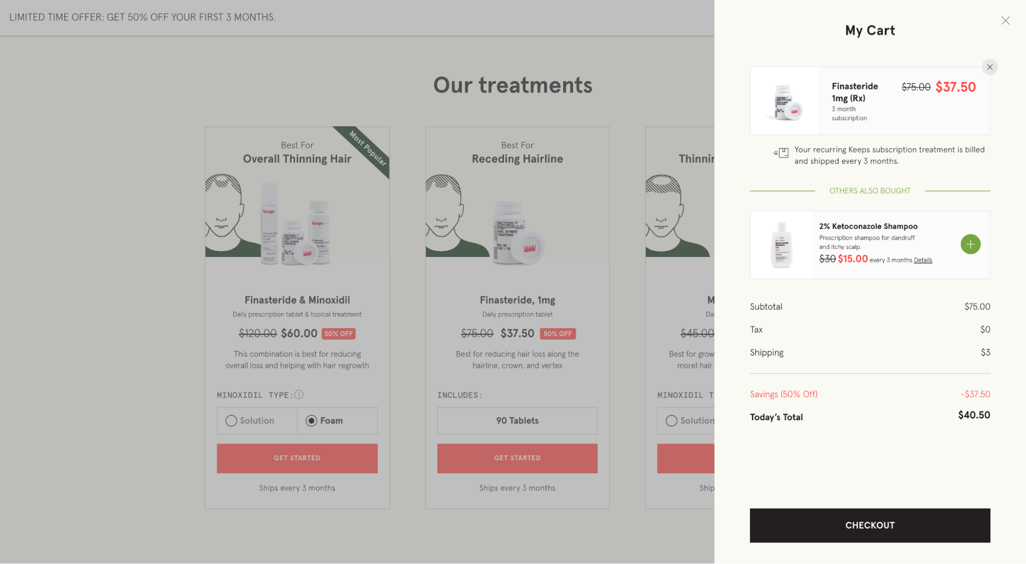
What we love: Everything
Honestly, from the headline and bullet points to the visual aides and checkout popup, this click-through page delivers a clear and irresistible offer with reduced risk and high perceived value. Well done.
10. Adobe (Creative Cloud)
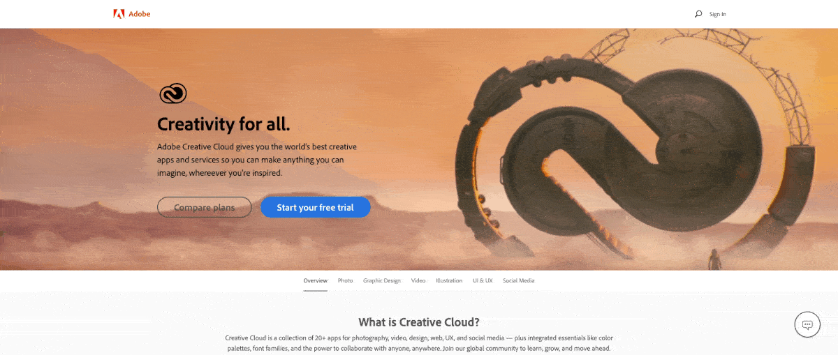
What we love: Hero shot (video)
A hero shot is the primary visual element (image or video) within the hero section (first section above the fold) of a click-through landing page. It sets the tone, adds context to the copy, and visually represents your product in a way words alone can’t. Adobe’s hero shot nails promoting their full suite of Creative Cloud (CC) apps (15+ creative apps). It plays a video reel that flips through dozens of versions of the Adobe CC logo, each designed using a different app (Animate, Illustrator, Photoshop, InDesign, etc.). Marvelous.
11. Dollar Shave Club
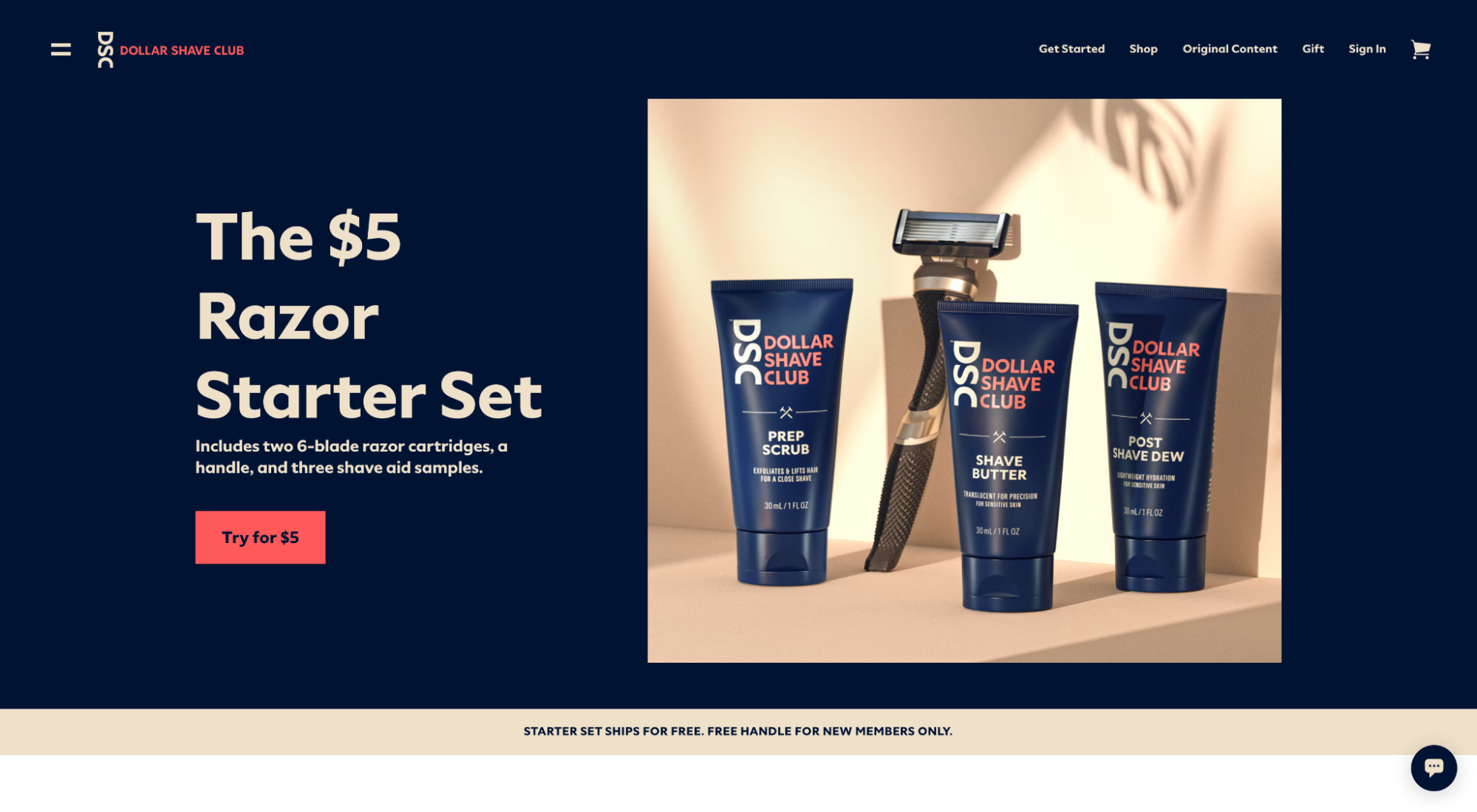
What we love: CTA button copy
Good landing pages write generic CTA copy, but great landing pages include the benefit within the CTA copy—and that’s exactly what Dollar Shave Club does here. Instead of using a generic CTA like “Try it,” or “Order now,” they use their CTA copy to remind visitors of the high-value offer: “Try it for $5.” Subtle, but effective.
12. Allure Beauty Box
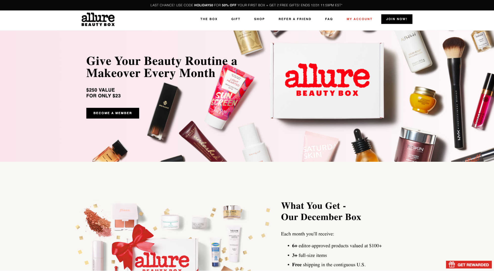
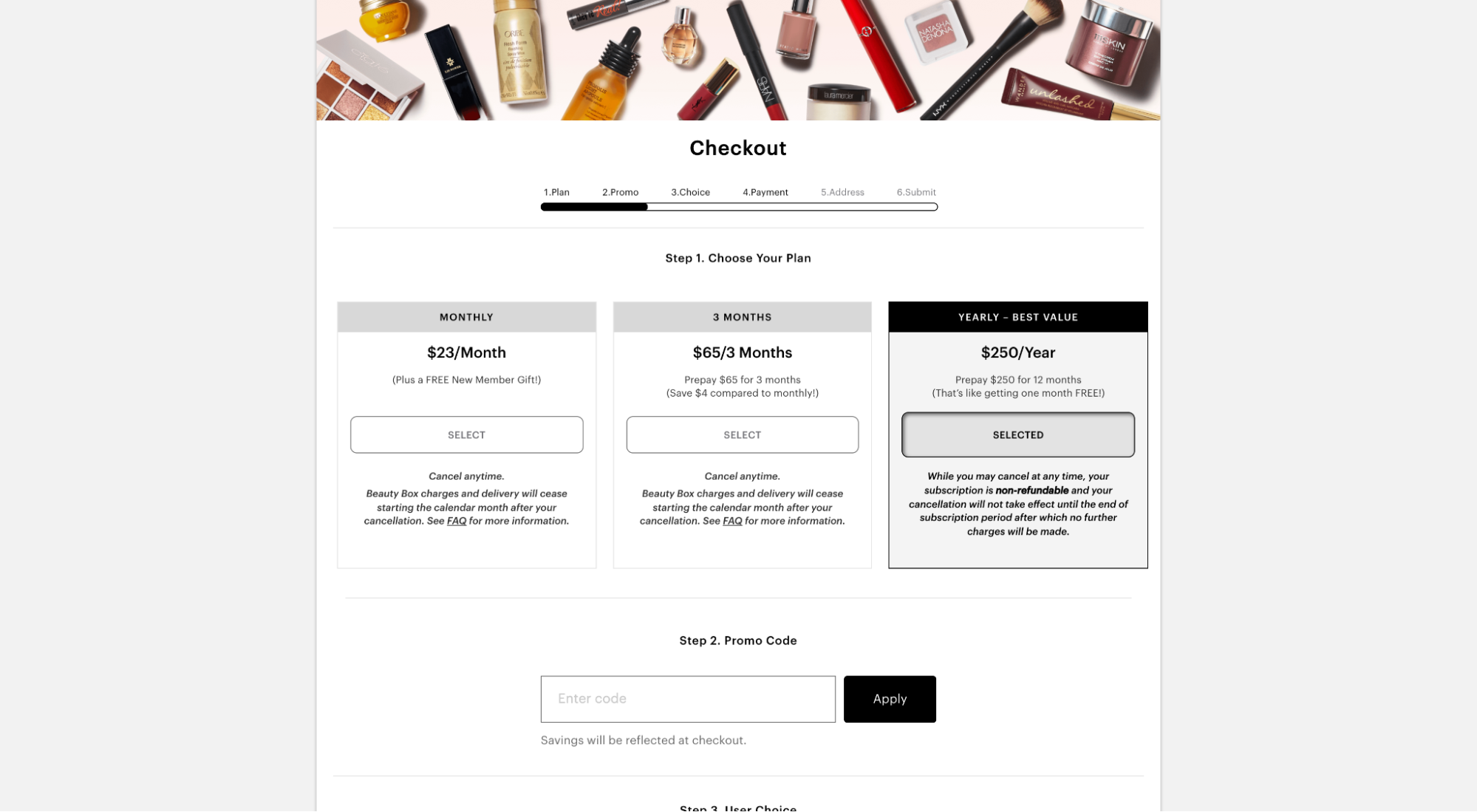
What we love: Incentives
Not only does Allure provide value-based pricing options (three different price tiers), but they offer a free bonus incentive (premium skincare bundle) for subscribers who opt-in before 1/3/22. Incentive + urgency = conversion gold.
13. SEMRush
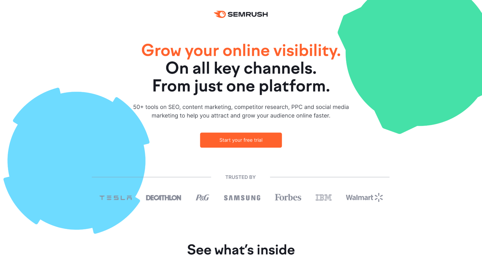
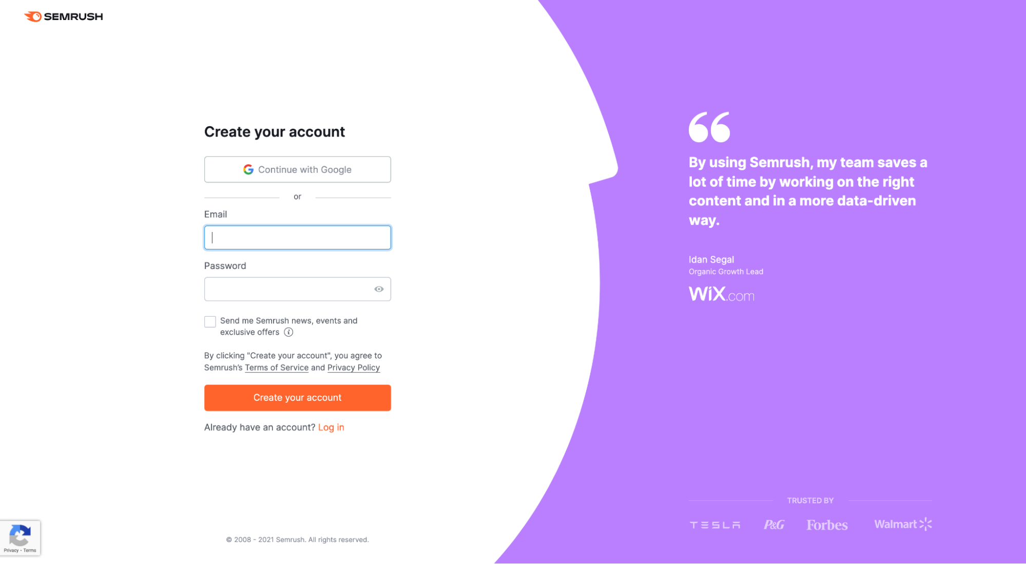
What we love: Headline
Honestly, this entire landing page is awesome. SEMRush does a fabulous job packing a ton of benefits (from over 50+ tools) into one clear and concise click-through page without making the tool feel overwhelming. But what we love most is the headline and subheadline: “Grow your online visibility. On all key channels. Using just one platform. 50+ tools on SEO, content marketing, competitor research, PPC, and social media marketing to help you attract and grow your audience online faster.” You got my attention.
Key takeaways
Though we didn’t A/B test these click-through pages ourselves, and we don’t have access to conversion data, we do know what it takes to create a high-converting click-through page. And each of these examples flexes their conversion muscles in different ways.
- Headlines and subheadlines that capture attention and deliver your value proposition
- Engaging product videos and visual aids that make the invisible visible.
- Persuasive copy that’s short on features, long on benefits
- Social proof from clients, user stats, and third-party award sites
- Irresistible offer (only one)
- Compelling call-to-action
- Optimized click-through page
What’s next? Start building your click-through landing page. We got you covered: A Landing Page Builder For Every Occasion (The Best 9 Reviewed)


