If you’ve ever registered for a webinar, downloaded a freebie, or subscribed to a newsletter, you've likely encountered a squeeze page.
But what is a squeeze page? Where does it get its funny name? How is it different from a landing page? And what separates a good one from a bad one?
Most importantly, who squeezes who, and for what?
Because someone’s getting squeezed, and it’s not me. Or is it?
In this article, we’ll answer each of those questions (and a bunch more). Plus we’ll provide 11 of our favorite squeeze page examples from 2022, complete with screenshots, pros and cons, and overall grades.
- What is a squeeze page?
- Squeeze page vs. landing page
- Benefits of a squeeze page
- Squeeze page best practices
- 11 of the best squeeze page examples (with grades)
- 1. Branded newsletter squeeze page (MorningBrew)
- 2. e-Book squeeze page (Intercom)
- 3. Membership site squeeze page (Drift)
- 4. Webinar registration squeeze page (LeadPages)
- 5. Email series squeeze page (CopyBlogger)
- 6. Free download squeeze page (Wistia)
- 7. Resource guide squeeze page (Hubspot)
- 8. Book waiting list squeeze page (Dave Gerhhardt)
- 9. Account registration squeeze page pop-up (RealSelf)
- 10. Industry report squeeze page (Outreach)
- 11. Newsletter squeeze page (Exploding Topics)
- How to create a squeeze page
- Wrapping up
Get brand new landing page strategies straight to your inbox every week. 23,739 people already are!
What is a squeeze page?
A squeeze page is a type of landing page designed specifically for capturing emails. That’s it.
Everything about the page works to “squeeze” email addresses out of visitors.
In exchange for an email, a squeeze page makes an offer, usually a download, on-demand webinar, resource guide, or other top-of-funnel lead magnets.
You can send paid traffic, organic traffic (e.g. SEO), referral traffic (e.g. social media), or direct traffic to these pages.
Squeeze page vs. landing page
A squeeze page is a type of landing page.
Whereas landing pages can take many forms and pursue many objectives, a squeeze page is laser-focused on capturing email addresses.
Also, landing pages typically aim to sell a product or services (bottom of funnel), which is why they run longer, include more details, and target prospects looking to buy soon.
A squeeze page, however, aims to sell a top-of-funnel offer (usually free), not a product or service, which is why they’re short, less detailed, and target a broader audience of potential customers who might enter the market in the future.
For example, below is a click-through landing page from GatherContent. The goal of this landing page is to increase free trial signups for their content marketing software.
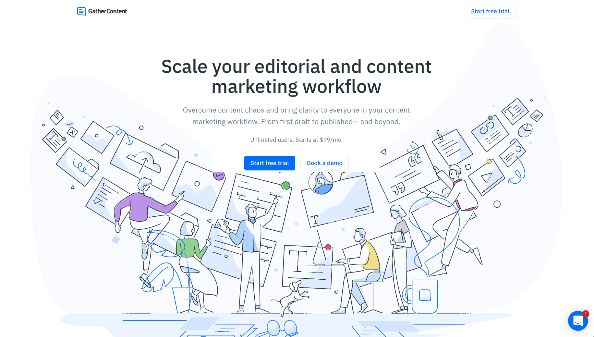
View full-length lander: GatherContent click-through landing page
And below is a squeeze page example, also from GatherContent. The goal of this is to capture email addresses in exchange for an exclusive resource guide.
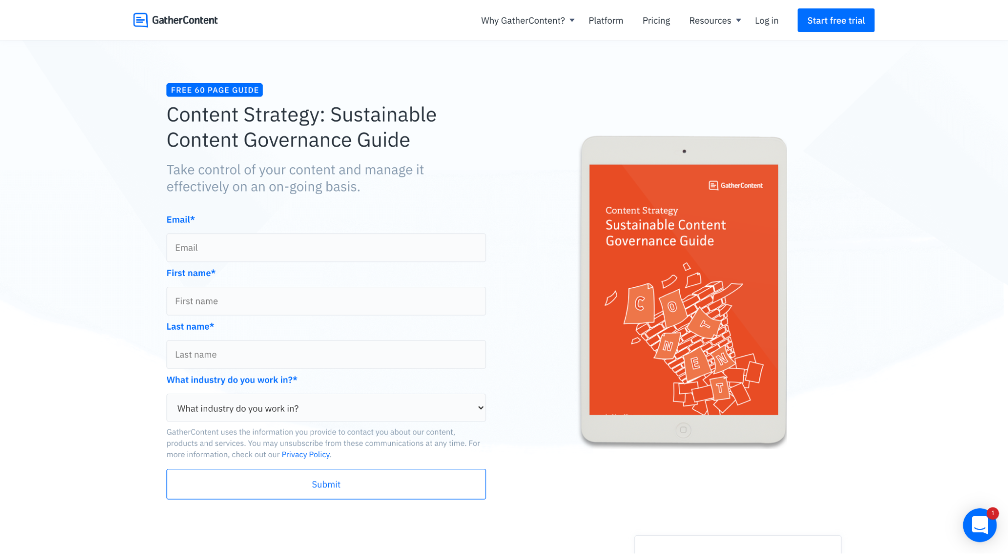
Both are landing pages, but one is a click-through landing page, and the other is a squeeze page landing page.
Benefits of a squeeze page
Like any type of landing page, a squeeze page is designed to increase conversion rates. Simple.
No matter the offer, creating a dedicated squeeze page can help you increase conversions by eliminating distractions, promoting the benefits of your offer, and providing a clear and compelling call to action (CTA).
But why do businesses create squeeze page offers to begin with? What’s the point of offering something for free in exchange for an email?
- Qualify leads: You can use squeeze page offers to gauge the temperature of your traffic. For example, if someone exchanges their email for a whitepaper exploring a problem you solve, they could be in the problem-awareness stage of their journey. Market accordingly.
- Collect first-party data: As Apple’s iOS14 update makes retargeting and online advertising harder, you can use squeeze pages and offers to collect first-party data (names, emails, phone numbers). Having this info makes it easier for you to target these users via PPC. Grow your own ad audience, one email address at a time.
- Initiate a funnel: Use a free offer to bring someone into your sales funnel, then nurture them with targeted messages or make an offer.
- Reduce dependence on third-party channels (email marketing 101): Create your own email list so you can communicate with prospects through a channel you own and control. Don’t just earn attention; keep it.
- Warm the market: People don’t buy from random brands they’ve never heard of before. Use a squeeze page offer to generate awareness, trust, and familiarity before making a pitch.
Note: For all you lead generation marketers out there, just because someone gives you their email address, that doesn’t necessarily make them a lead. Act responsibly.
Squeeze page best practices
Squeeze page design is no different than landing page design. If you follow a list of tried-and-true best practices, and you put a singular focus on capturing emails, you’ll start amassing conversions in no time.
Bottom line: If you want predictable results, then you need to bake predictability into your squeeze pages. This is why the best squeeze pages follow a repeatable checklist:
- Offer: What do I get in exchange for my contact information? If it’s not worth giving up your email, nothing else matters. The visitor needs to see the value.
- Attention-grabbing headline: Does the headline grab attention, state the value proposition clearly, and keep the visitor's eyes moving down the web page?
- Enticing subheading: Does the subheadline expand upon the value proposition with an enticing, irresistible offer?
- Key highlights: Does the body of the squeeze page provide details about what to expect on the other side of the form?
- Call-to-action button: Does the CTA button ice the cake with a clear and compelling request?
- Email capture form: Is the lead form focused on capturing emails first and foremost?
- Social proof (testimonials, logos, reviews): Do you back up your claims with third-party testimonials and clout?
- Exclusivity: is there something on the other side of the form that you can’t get without handing over your address?
- Scarcity: Is there urgency baked into your offer?
- Instant gratification: After someone gives you their email, can they engage with your offer immediately?
- Visual aids: Do you use visuals to support the copy and context of your offer?
- Teaser/preview: Is there a way for visitors to preview or sample what’s on the other side of the lead form?
- Minimal exit links: Does the squeeze page offer only one way out (a conversion)? Or does it provide too many exit opportunities? Keep it focused.
If you answered yes to most of those questions, then chances are you’ve got a high-converting squeeze page. If you answered no to most of those questions, revisit your lander and make some updates.
11 of the best squeeze page examples (with grades)
As a performance marketing agency that specializes in conversion rate optimization (CRO) and landing page design, we’ve seen our fair share of squeeze pages.
We rounded up 11 squeeze page examples to fuel your inspiration.
Included in each example is a link to the full lander, an overall score (scale from 1-10), a brief overview, and squeeze page pros and cons.
- Branded newsletter (MorningBrew)
- Free eBook (Intercom)
- Membership site (Drift)
- Webinar (LeadPages)
- Email series (CopyBlogger)
- Free downloads (Wistia)
- Newsletter (Exploding Topics)
- Resource guide (Hubspot)
- Book launch (Dave Gerhardt)
- Register pop up (RealSelf)
- Industry report (Outreach)
Let’s explore!
1. Branded newsletter squeeze page (MorningBrew)
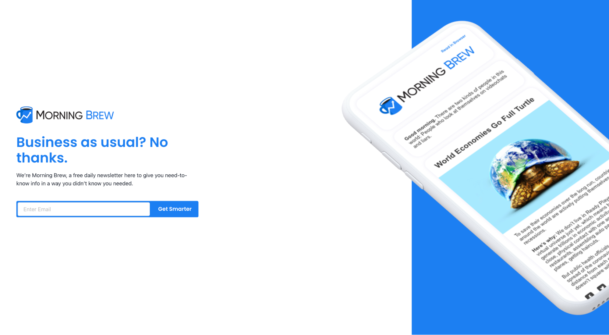
View full squeeze page: MorningBrew opt-in
MorningBrew is a branded newsletter turned media publisher that publishes some of the most popular email publications in the world. Their business model is email subscriptions, literally. MorningBrew funds its entire operation with newsletter advertisers. More subscribers = more ad revenue.
Overall score: 7/10
Pros:
- Above the fold
- Single form field (email)
- Visual aide that provides context
- Attention-grabbing headline (“Business as usual? No thanks.”)
- Enticing subheading (“...free newsletter that gives you need to know into…”)
- Compelling CTA button (“Get smarter”)
- Instant gratification (view articles instantly after opting-in)
Cons:
- Missed social proof opportunity. MorningBrew has over 3M subscribers. Why no mention?
- It’s very exclusive. While MorningBrew does have a website, you can only get their content via email. It’s literally subscriber-only.
- There is no teaser. Though the visual aide shares a glimpse, why no preview email?
2. e-Book squeeze page (Intercom)
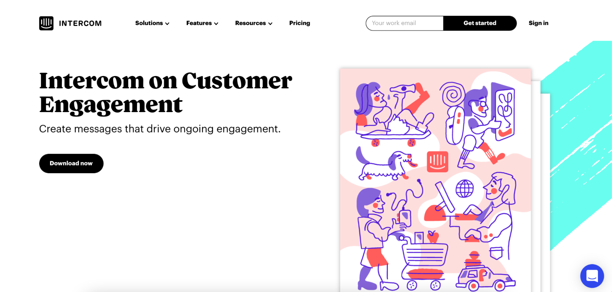
View full squeeze page: Intercom on Customer Engagement
Intercom is the leader in live chat software. Aside from a killer product, they also have a killer resource library chock full of valuable resources like guides, books, and on-demand webinars. This squeeze page example is for one of their e-books: Intercom on Customer Engagement.
Overall score: 10/10
Pros:
- Attention-grabbing book title/headline (“Intercom on Customer Engagement)
- Enticing subheading with benefit (“Create messages that drive ongoing engagement”)
- Key highlights (supporting copy below the fold)
- Clear CTA (“Download now”)
- Instant gratification (read book immediately after opting in)
- Social proof (quote from Ann Handley)
- Design (distinct and evocative)
- Simple form (button pops up a basic form with firmographic fields)
Cons:
- If we’re going to get nit-picky, the layout seems a tad wonky. There’s a big gap to the left of the hero image as well as below it.
3. Membership site squeeze page (Drift)
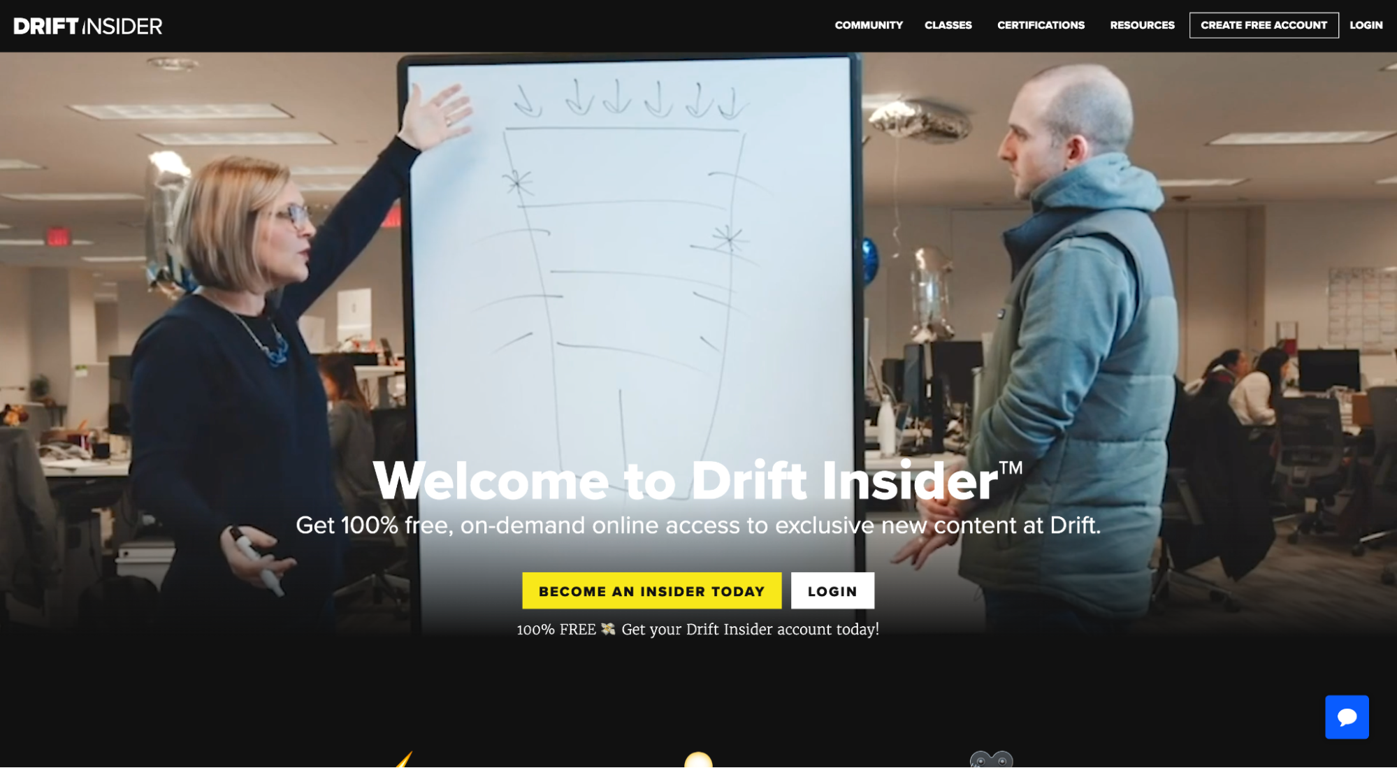
View full squeeze page: Drift Insider
Drift is the pioneer of the conversational marketing category and, now, revenue acceleration category. They’ve built their empire on the backs of high-quality, gated content.
This squeeze page is for their insider community, aptly named Drift Insider. Drift Insider has converted over 45,000 visitors into subscribers on this beautifully executed squeeze page.
Overall score: 10/10
Pros:
- Attention-grabbing headline (“Welcome to Drift Insider”)
- Enticing subheading (“Get 100% free on-demand online access to exclusive new content at Drift”)
- Social proof (“45,000 members,” testimonials)
- Teaser (popular Drift Insider content preview)
- Exclusivity (subscriber-only content)
- Visual aid (background video teaser)
- Compelling CTA (“Become an Insider today”)
- Key highlights (“400+ classes,” “1,000+ videos”)
- Instant gratification (full access upon subscribing)
- Stunning design
- Simple form with social proof
Cons: All good!
4. Webinar registration squeeze page (LeadPages)
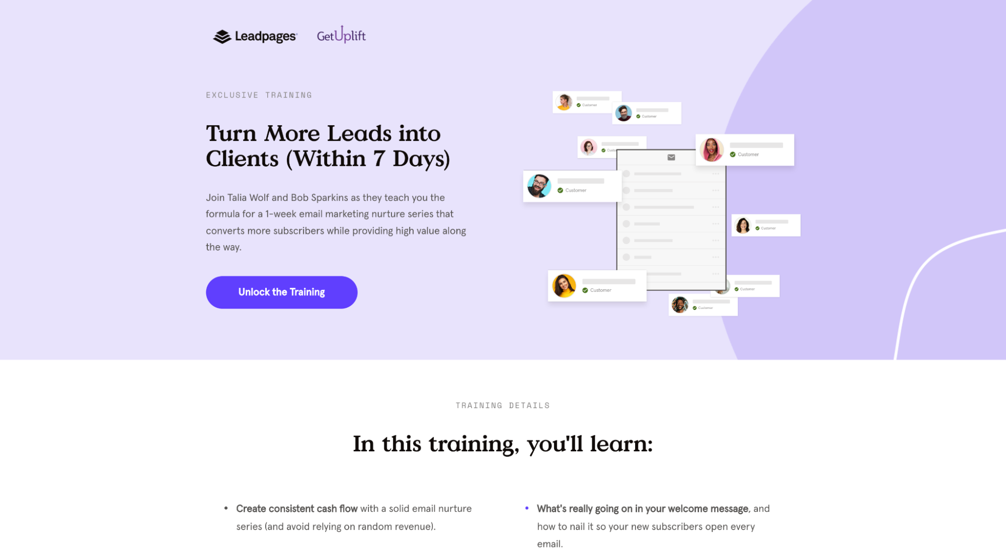
View full squeeze page: Turn More Leads Into Clients webinar registration
LeadPages is one of the top three landing page builders in the game. Aside from an incredible tool, LeadPages is an incredible marketing enterprise. Resource guides, podcasts, free downloads, on-demand webinars, blog posts…LeadPages does it all.
This squeeze page is for one of their on-demand webinars—and it’s pretty damn good.
Overall score: 9/10
Pros:
- Attention-grabbing headline (“Turn More Leads into Clients Within 7 Days”)
- Enticing subheading (“...formula for a 1-week email nurture series that converts more subscribers…”)
- Social proof (credible guest presenter, Talia Wolf from GetUplift)
- Key highlights (“In this training, you will learn…”
- Visual aid (hero graphic, presenter photos)
- Instant gratification (watch webinar immediately after email opt-in)
- Compelling CTA (“Unlock the training”)
- Beautiful design
- Simple form
Cons:
- No teaser. How about one-minute video teasers from the guest presenter and host?
- No exclusive content or value is pointed out. Is there anything valuable at the end of the webinar that I can’t get anywhere else?
5. Email series squeeze page (CopyBlogger)
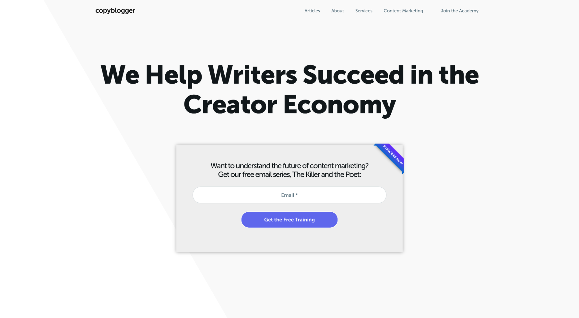
View full squeeze page: The Killer and the Poet
Copyblogger started as a content marketing blog, which morphed into a digital marketing software platform, and now offers a paid educational academy.
This squeeze page/homepage is for an educational email series called The Killer and the Poet, delivered by Copyblogger founder, Brian Clark.
Overall score: 6/10
Pros:
- Attention-grabbing headline (“Want to understand the future of content marketing?”)
- Enticing subheading (“Get our free email series, The Killer and the Poet”)
- Simple form (just an email)
- Exclusivity (subscriber-only content)
- Instant gratification (receive email #1 within minutes of subscribing)
Cons:
- No info on what to expect in the series, including frequency, discussion points or duration.
- No preview email.
- No compelling CTA. “Get the free training” doesn’t have me on the edge of my seat, and it’s slightly confusing given the headline. Is this a training program? Or a narrative series? I can’t tell.
- No social proof. What third-party, credible sources can vouch for this series? How many subscribers?
6. Free download squeeze page (Wistia)
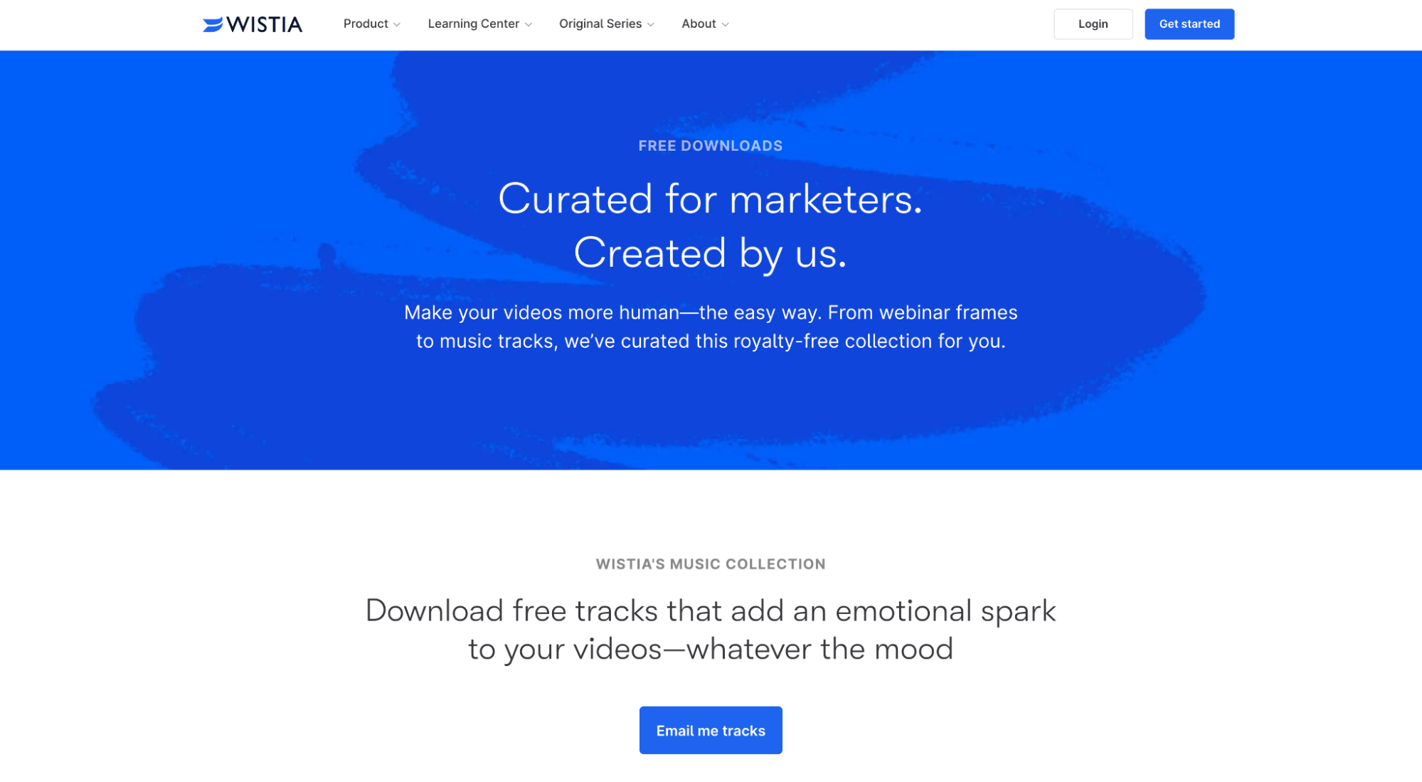
View full squeeze page: Wistia free video editing downloads
Wistia is the leading video hosting software for businesses small and large. They’re also brand-building wizards. What was first started as a blog, Wistia’s resource center has transformed into an entertainment hub complete with free downloads, on-demand webinars, and several long-form video series.
This squeeze page is for their free downloads offer. Subscribers get free background music tracks, frame overlays, and motion graphics templates.
Overall score: 9/10
Pros:
- Attention-grabbing headline (“Free downloads: Curated by marketers, created by us”)
- Enticing subheading (“Make your videos human, the easy way. From webinar frames to music tracks, we’ve curated this royalty-free collection for you.”)
- Teaser (you can preview every download from the squeeze page)
- Exclusivity (subscriber-only downloads)
- Visual aid (video previews of downloads)
- Clear CTA (“Send me the tracks”)
- Key highlights (you can literally see what’s behind each download before opting in)
- Instant gratification (full access upon subscribing)
- Great landing page design
- Simple form (email only)
Cons:
- I’m hesitant to say social proof because the ability to view downloads before opting-in supersedes it.
7. Resource guide squeeze page (Hubspot)
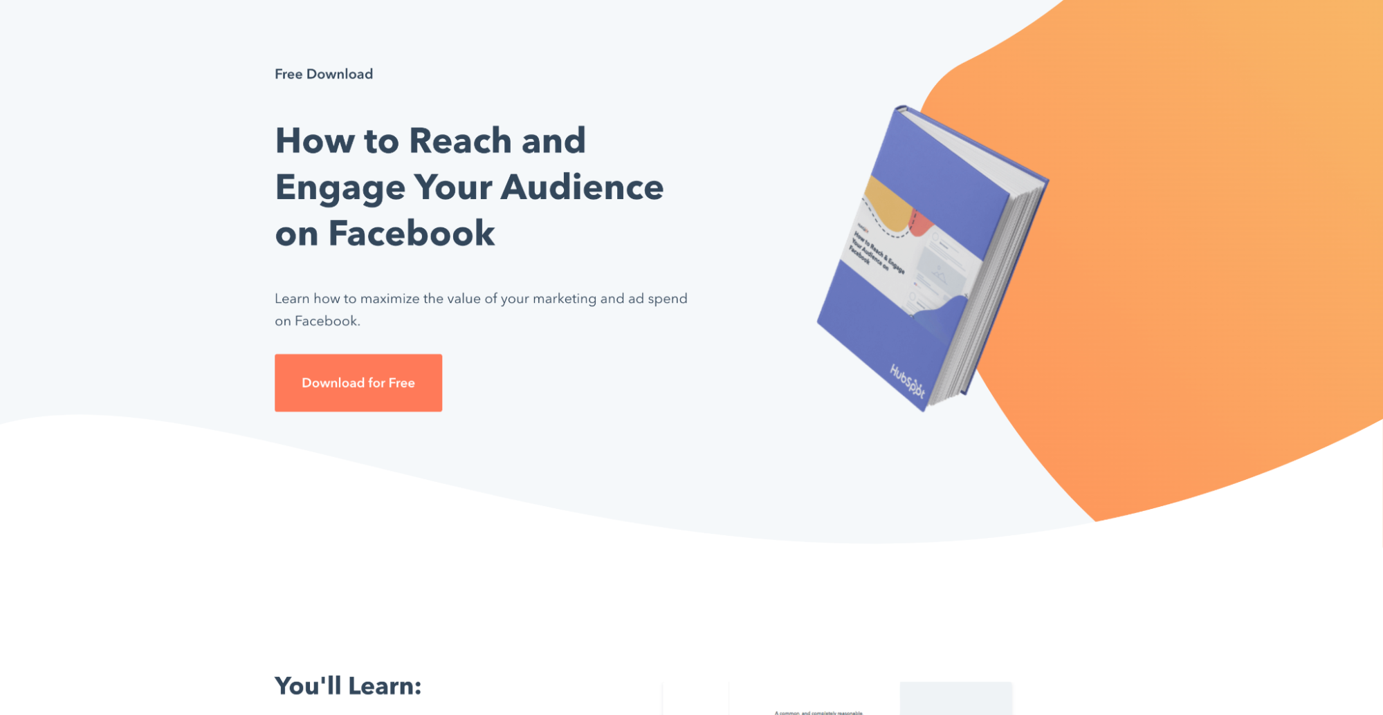
View full squeeze page: How to Reach and Engage Your Audience on Facebook
Hubspot is a marketing automation and CRM platform for inbound marketers.
This page is for one of their many downloadable resource guides. While it’s pretty good, it has room for improvement.
Overall score: 9/10
Pros:
- Attention-grabbing headline (“How to Reach and Engage your Audience on Facebook”)
- Enticing subheading (“Learn how to maximize the value of our marketing and ad spend on Facebook.”)
- Key highlights (“You’ll learn…” section)
- Teaser (screenshots of pages within guide)
- Social proof (“45,000 members,” testimonials)
- Exclusivity (opt-in only content)
- Visual aid (hero shot + screenshots)
- Compelling CTA (“Download for free”)
- Instant gratification (full access upon opting-in)
- Great landing page design
- Simple form (name + email)
Cons:
- How many downloads have there been so far?
- Any testimonials from readers?
- Who wrote it? Why should we trust this information?
8. Book waiting list squeeze page (Dave Gerhhardt)
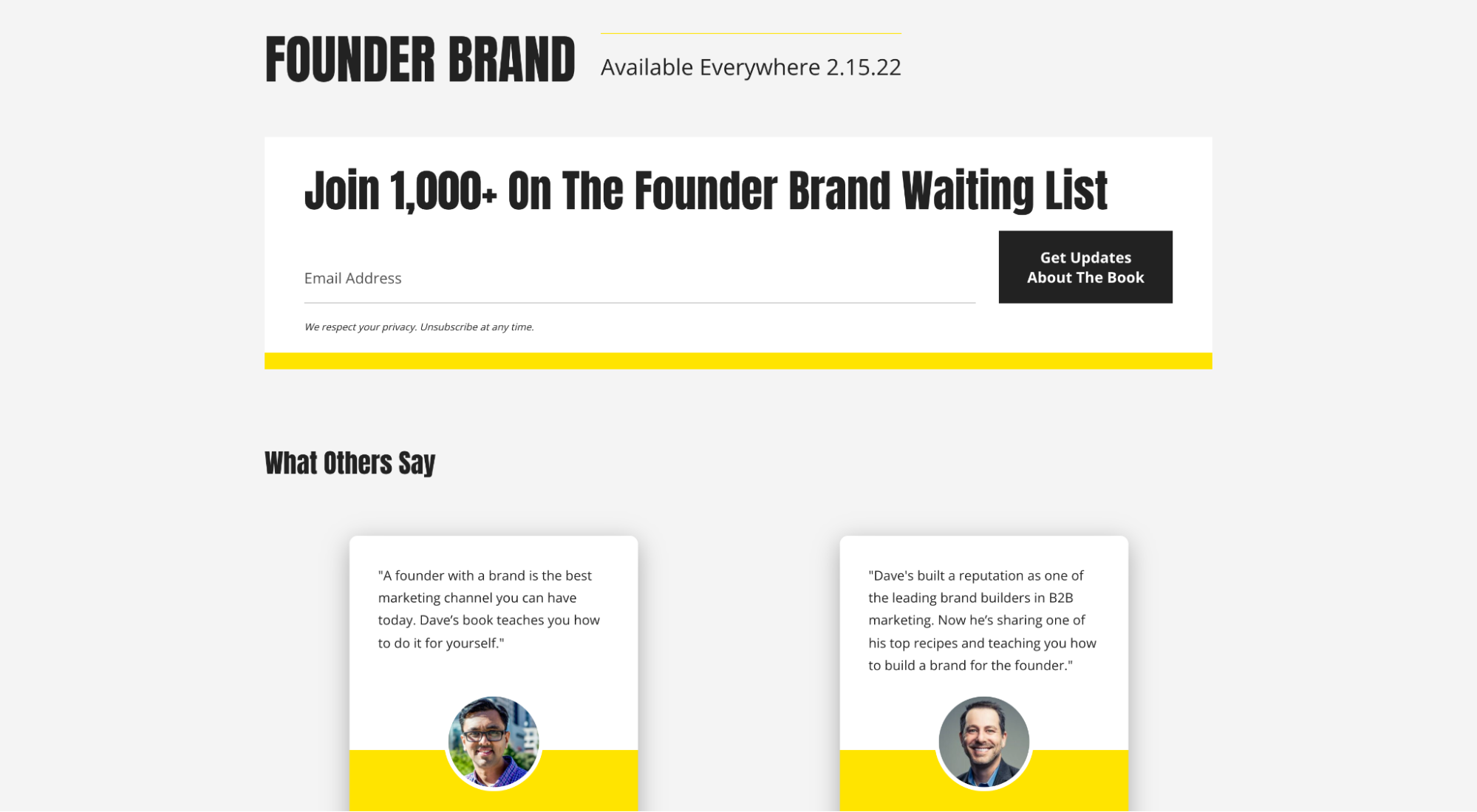
View full squeeze page: Founder Brand by Dave Gerhardt
Dave Gerhardt is the former CMO of Drift turned rogue community builder. Founder Brand is his first book set to hit shelves in 2022.
This page is to promote the launch of his book and capture emails from those interested in a copy. What it lacks in design it makes up for in some of the most serious social proof we’ve ever seen.
Overall score: 8/10
Pros:
- Attention-grabbing headline (“Join 1,000+ on the Founder Brand waiting list”)
- Social proof (Ross Simmonds, Hiten Shah, Bill Macaitis, David Cancel, Ben Jabbawy, Sara Varni, Thoman Eisenmann, Patrick Moran…’nuff said)
- Teaser (preview the forward written by Hiten Shah)
- Key highlights (thorough overview penned by Dave himself)
- Exclusivity (be the first to get your copy)
- Clear CTA (“Get updates about the book”)
- Simple form (email only)
Cons:
- Not the best design, but design takes a backseat. It’s still good enough that it doesn’t raise a red flag about trust or credibility.
- No book cover?
- No instant gratification. How about a free chapter if we opt-in?
9. Account registration squeeze page pop-up (RealSelf)
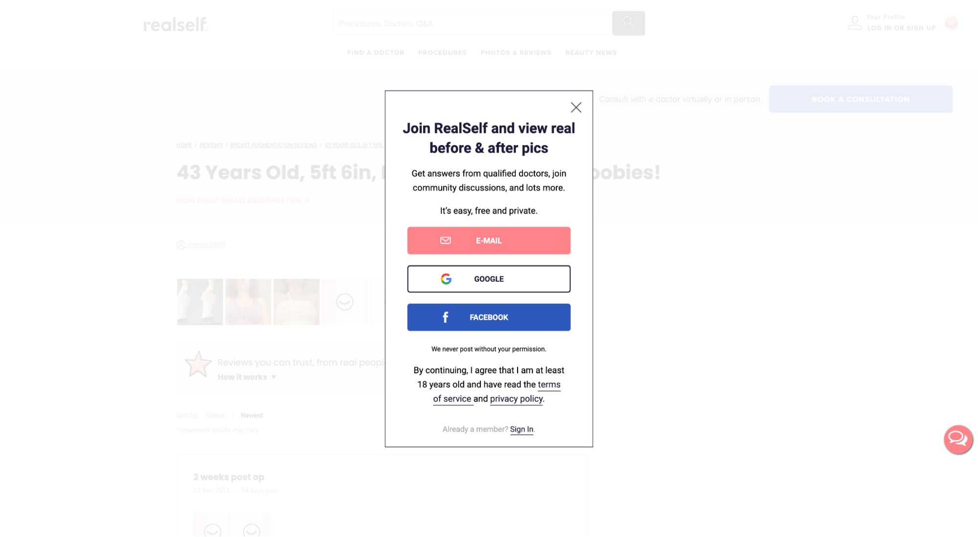
View full squeeze page: RealSelf.com
RealSelf is an online platform and community that provides advice and reviews on elective cosmetic procedures.
This example is the first (and only) pop-up squeeze page that made our list, and its goal is to get visitors to create/register an account to proceed further into the site (though you can still exit out and navigate with limitations).
Overall score: 9/10
Pros:
- Attention-grabbing headline (“Join RealSelf and view real before and after pics”)
- Enticing subheading (“Get answers from qualified docs, join community discussion, and much more.”)
- Teaser (you can preview the entire site before opting-in)
- Exclusivity (exclusive privileges, like commenting, when you register)
- Instant gratification (full access upon registering)
- Simple form (email only, or Google/Facebook account)
- Pop-up (easy to exit)
Cons:
- This squeeze page doesn’t incorporate all of the aforementioned squeeze page best practices, but it’s also a different kind of squeeze page, and context matters. Before meeting this page, visitors will have already previewed everything there is to offer on the RealSelf platform. The squeeze page doesn’t need to sell RealSelf, it just needs to get visitors to the next step quickly—and that’s what it does.
10. Industry report squeeze page (Outreach)
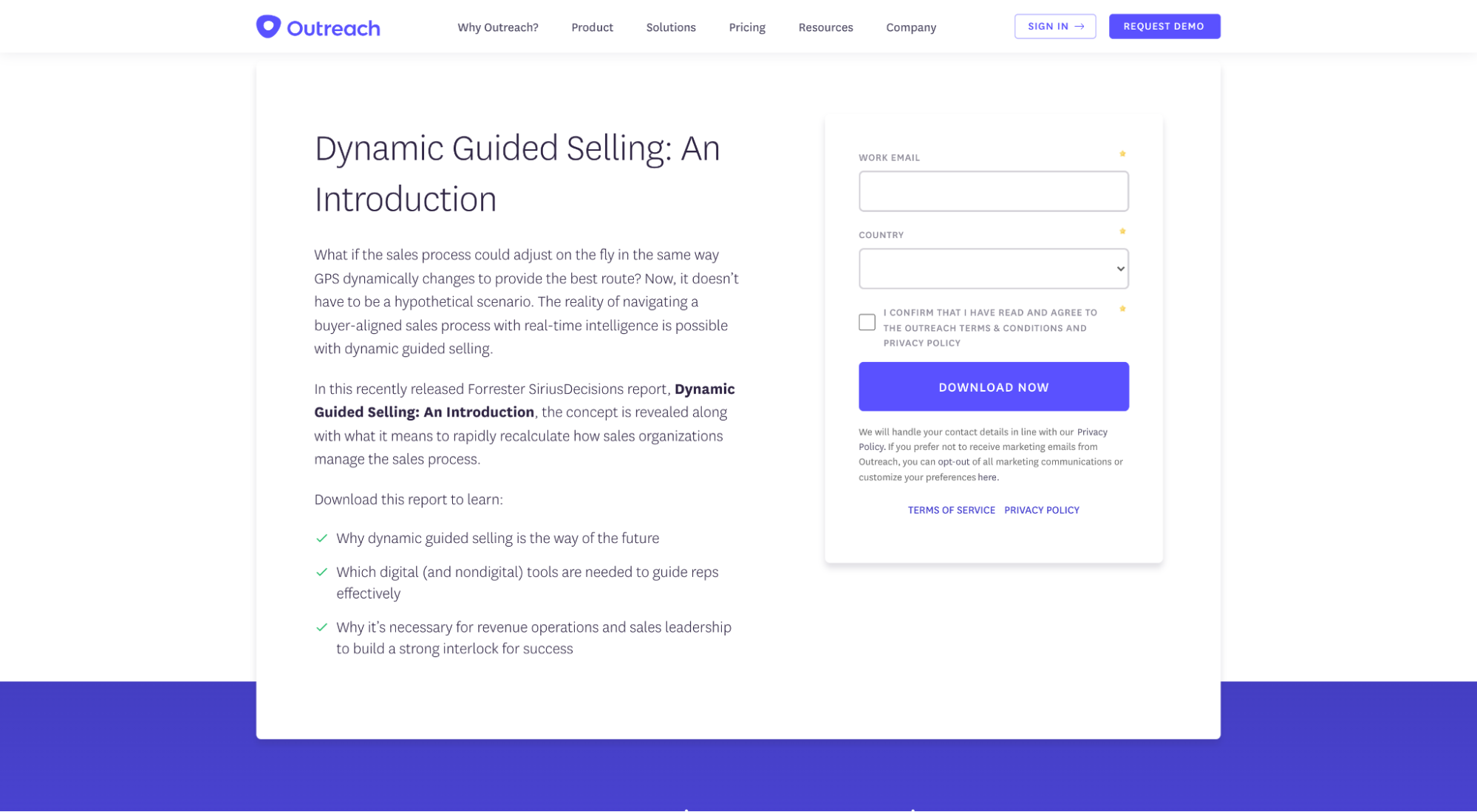
View full squeeze page: Dynamic Guided Selling
Outreach is a sales engagement platform that makes prospecting, communication, and collaboration easier and more effective.
This page is for one of their many industry reports.
Overall score: 7/10
Pros:
- Attention-grabbing headline (“Dynamic Guided Selling: An Introduction”)
- Exclusivity (subscriber-only content)
- Clear CTA (“Download now”)
- Key highlights (“Download the report to learn...”)
- Instant gratification (full access upon subscribing)
- Simple form (work email + country)
Cons:
- No social proof. How about a logo of Forrester (who helped write it)?
- Zero visuals to add context.
- No idea of what it looks like inside the report. How about a preview of some of the pages or graphs?
11. Newsletter squeeze page (Exploding Topics)
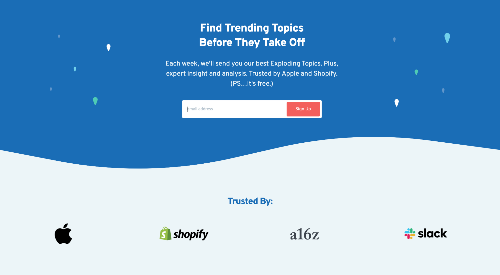
View full squeeze page: Exploding Topics
Exploding Topics is the latest startup from Backlinko founder, Brian Dean. Think of it like Google Trends on steroids.
This is a page for their weekly newsletter which sends a preview of their trends data directly to your inbox.
Overall score: 10/10
Pros:
- Attention-grabbing headline (“Find trending topics before they take off)
- Enticing subheading (“...Exploding topics, plus expert insight and analysis. ”)
- Social proof (“Trusted by Apple, Shopify, A16z, Slack…’nuff said)
- Teaser (sample trend newsletter)
- Exclusivity (subscriber-only content)
- Visual aid (logos, testimonial headshots, clean design)
- Clear CTA (“Sign up)
- Simple form (email only)
Cons:
- All good
How to create a squeeze page
How do you create a squeeze page for your website or campaigns? Using a squeeze page builder.
Any drag-and-drop landing page builder worth its salt can also build high-quality squeeze pages.
Good news: We wrote an entire article on landing page builders that includes nine best-in-class builders for every occasion, all of which can help you create a squeeze page.
But let’s review the top three here:
- Unbounce: best overall landing page builder (+ squeeze page templates)
- LeadPages: most affordable all-around page builder (+ squeeze page templates)
- Instapage: easiest to use landing page builder (+ squeeze page templates)
You can create a squeeze page without a landing page builder, but page builders make creating, publishing, and A/B testing (AKA split testing) squeeze pages fast and easy.
Wrapping up
So who’s getting squeezed?
Yeah, we’re all getting squeezed.
But that’s OK because the pot of gold on the other side of the squeeze page is worth the price of admission: an email address.
When creating your own squeeze pages, make a list and check it twice:
- Offer
- Attention-grabbing headline
- Enticing subheadline
- Compelling CTA
- Key highlights
- Email capture form
- Social proof
- Teaser/preview
- Exclusivity
- Scarcity
- Instant gratification
- Visual aids
Happy squeezing, friends.
